Choosing frame shapes for different photo subjects
Choosing the right aspect ratio for different photo subjects means deciding how the subject should feel, not chasing one universal number. A broad horizontal frame can suggest distance and calm; a vertical frame can add energy and direct attention; a square can make separate details relate as equals.
A good choice also respects where the image will live: a framed print, website gallery, property campaign or social feed. Keeping the master file adaptable lets the photographer change shape later without sacrificing the original composition.
Frame shape changes how a photograph reads
An aspect ratio describes the relationship between width and height: 3:2 means three units wide for every two units high, while 16:9 is markedly wider and less tall. It gives a viewer an immediate cue about scale, density and movement before any detail is examined. The boundaries also determine how easily the image can be placed beside text or inside a designed layout.
Orientation is the separate choice of turning that frame on its side. A horizontal 3:2 frame and a vertical 2:3 frame share the same proportions, yet they give a scene very different emphasis. Wide frames favour lateral space and environmental context; upright frames suit height, gestures and a clear path through the picture. The ratio guides the eye, but it does not choose the subject or create good composition automatically.
Begin with the subject and final destination
Most full-frame cameras and many APS-C models record a 3:2 image from a 36x24 or 16x24 sensor. Micro Four Thirds and certain other camera systems favour 4:3, while dedicated video modes often expose 16:9. Starting at the camera's native ratio preserves the largest available area and gives crops more room to breathe. Choosing a narrower frame at capture time can save storage, but it also fixes the composition before the final brief is known.
Choose the shape from the subject's needs and the destination. A family set may look coherent in one landscape proportion, while a tourism campaign can need horizontal panoramas, square social cards and vertical clips from the same shoot. Advice on image files, colour and output can be found in the site's complete guide. Keeping a full-resolution original means those versions can be derived without repeatedly enlarging a small crop.
Australian landscapes call for room and restraint
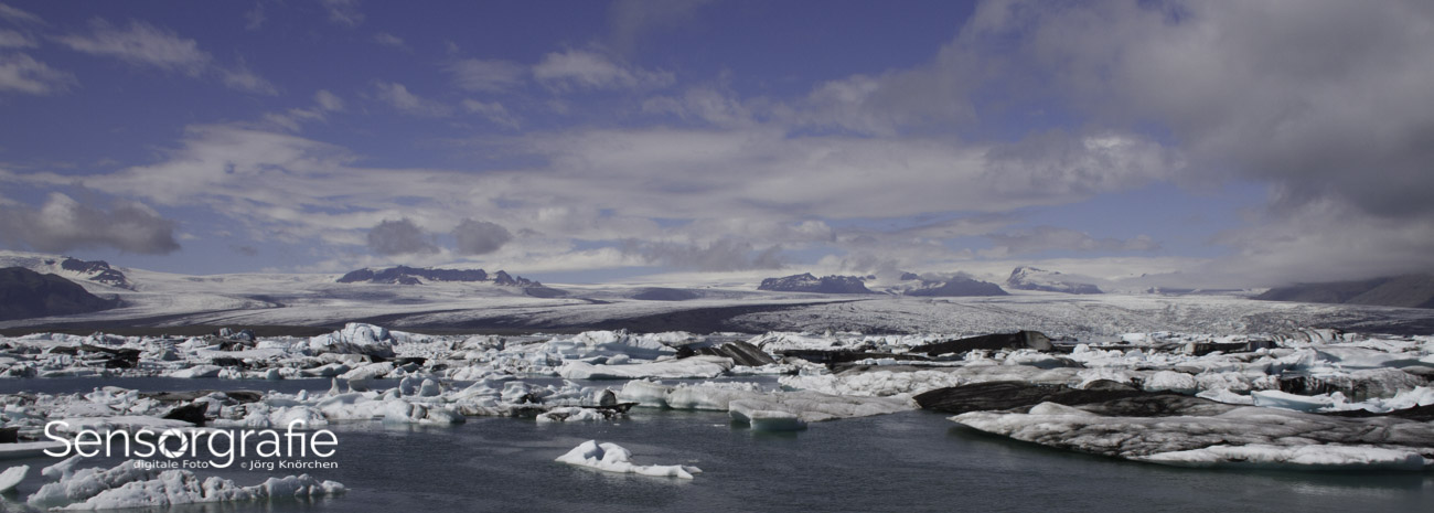
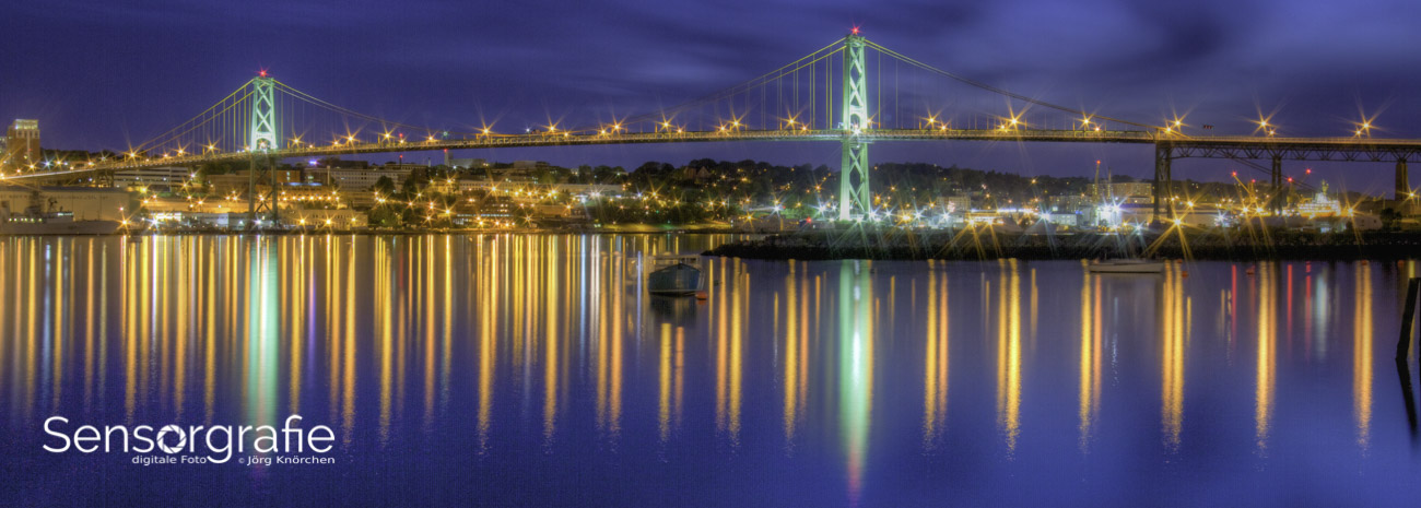
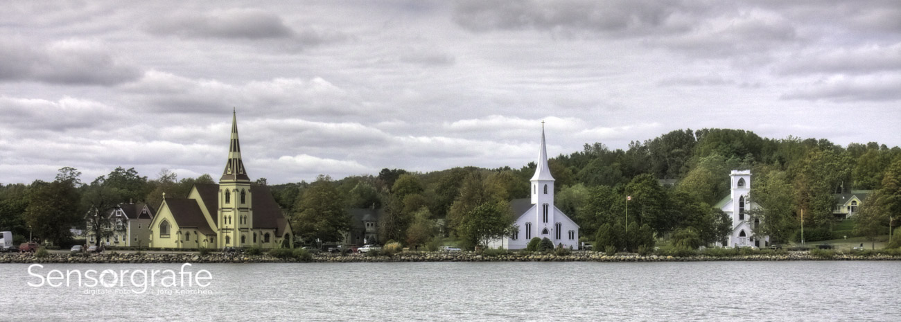
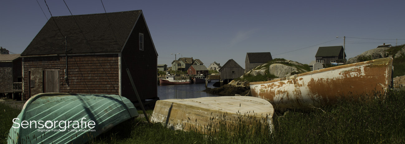
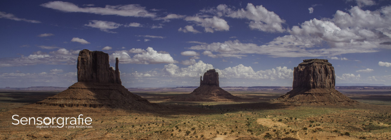
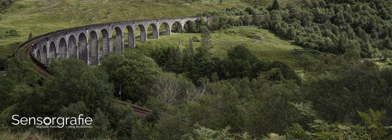
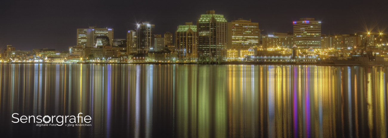
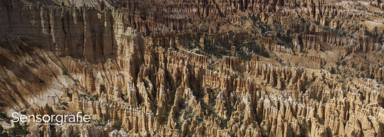
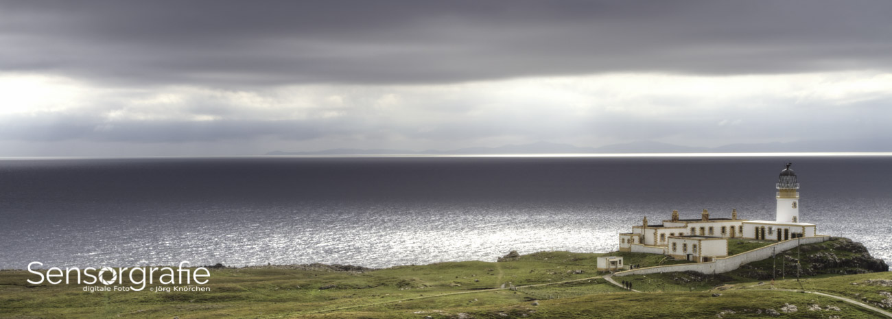
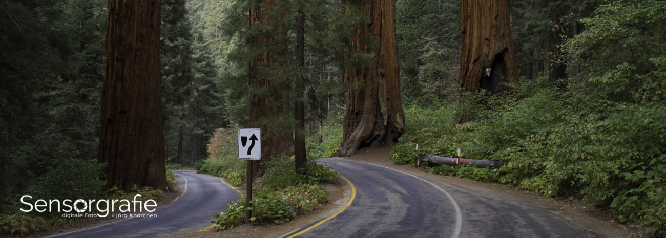
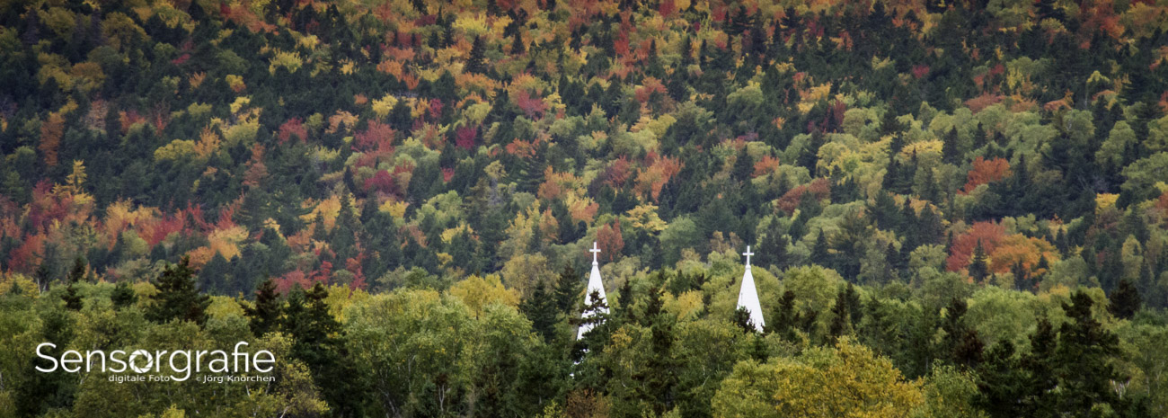
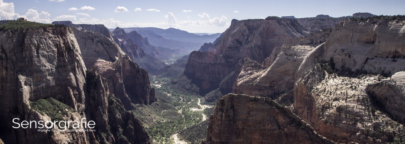
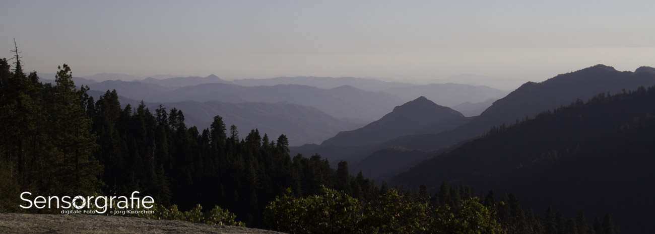
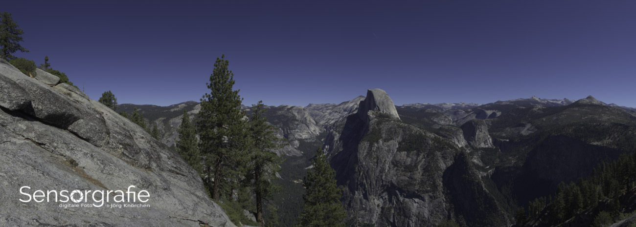
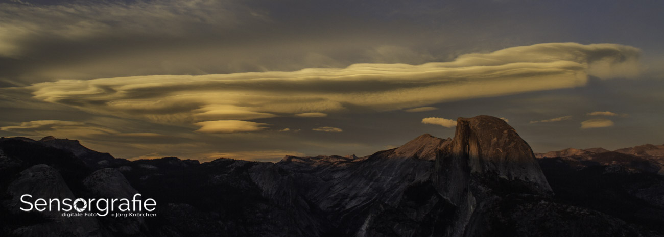
Australian landscapes make the relationship between frame and subject especially visible. At Uluru, the long road beside the ocean at the Great Ocean Road, or among the limestone stacks of the Twelve Apostles, a horizontal frame can hold a broad sweep without making the horizon look accidental. The native 3:2 ratio often feels natural because it follows the proportions of many lenses and camera sensors. A wider 16:9 crop creates a more cinematic panorama, while 2:1 can stretch distant ridges into a clean band.
A panorama needs deliberate joins and enough overlap between frames; simply narrowing an existing image can make it look thin and compressed. At the edge of the frame, the interest is often a tree, surfer, cyclist or red road cutting through scrub. A vertical 2:3 or 4:5 frame may suit those details better than a grand sweep, so changing orientation can improve variety within a trip portfolio.
Light matters as much as geometry. In the fierce arvo light of central Australia, deep shadows and pale sand can exceed the camera's dynamic range; a carefully chosen ratio cannot rescue clipped highlights. Expose for the brightest area, keep the horizon straight, and leave enough room around a subject for a calmer crop. Give it a go with a 2:1 frame, then compare it with 3:2 at full size before deciding which feels more like the place.
Comparing common frame shapes
Common formats divide into a few useful families, each with a different balance of atmosphere, detail and delivery convenience. The practical question is how much the frame must explain and how much it must exclude.
| Ratio |
Typical use |
Where it works well |
Main compromise |
| 3:2 |
General stills, landscapes and prints |
Native on many cameras; flexible for crops |
Tall social formats need extra attention |
| 4:3 |
General photography and compact cameras |
Offers more vertical space than 3:2 |
Requires cropping on many 3:2 sensors |
| 16:9 |
Video, web banners and cinematic landscapes |
Efficient on widescreen displays |
Limited room for tall subjects |
| 1:1 |
Square posts, compact groups and details |
Balances horizontal and vertical space |
Can feel crowded around central subjects |
| 4:5 or 2:3 |
Portraits, fashion and phone-first feeds |
Accommodates human height |
Needs breathing room and print variants |
| 2:1 or wider |
Panoramas, broad scenery and motion |
Emphasises sweep and scale |
Weak for isolated vertical subjects |
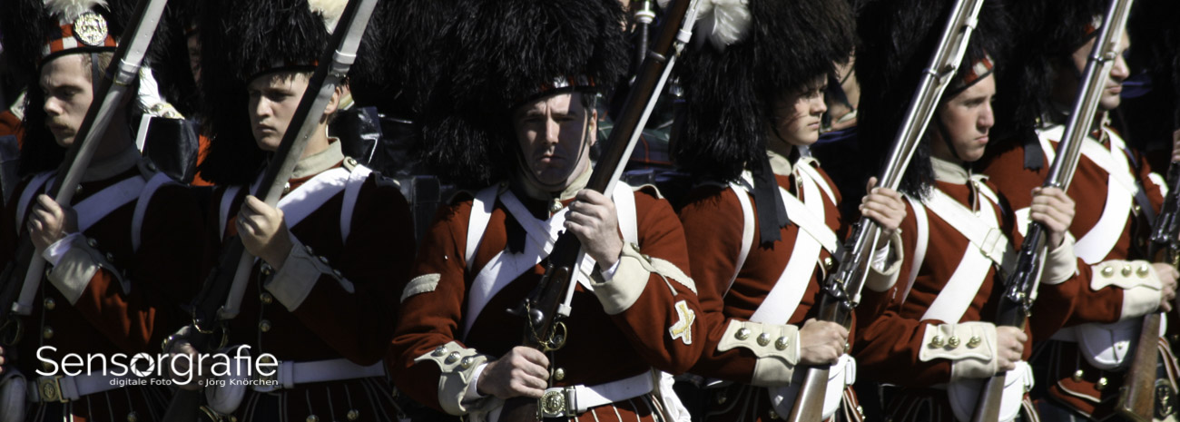
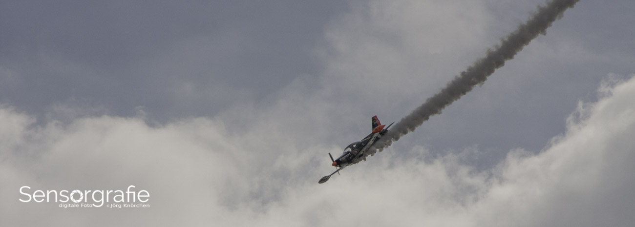
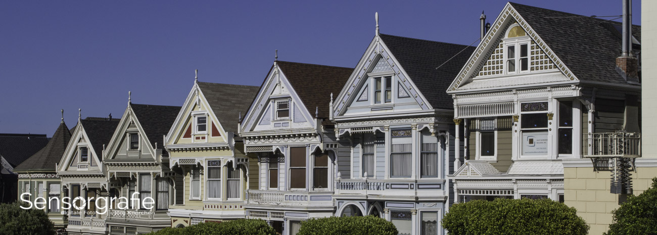
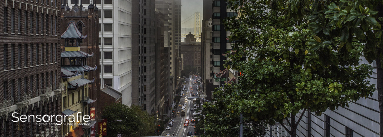
No row is universally correct. A 3:2 master keeps the most latitude for ordinary print and gallery work, while a 16:9 master favours video and screen. Portrait projects may prefer 2:3 because it resembles a hanging print, and social campaigns often reward 4:5 because it occupies more feed space. Compare the finished framing, not just the numbers: the same photograph can look composed in 16:9 and chopped in 3:2.
Portraits, streets and the Australian market
People and movement often favour an upright frame. A 2:3 portrait is effective for a full-length figure at a Melbourne laneway celebration, a couple beside Sydney Harbour or a family spread across a Bondi lawn. Keep space above heads and hands, because a tight vertical crop can turn a relaxed pose into a clumsy one. For a compact group, a square can equalise everyone, while 4:5 remains useful for phone-first delivery without losing the scene's height.
The Australian market often asks one shoot to serve several purposes. Wedding and family collections may end up on an A3 or A4 print, a canvas wrap and an Instagram or Facebook post, so photographers need a flexible master and correctly sized exports. Local clients often say they want the result to look “not too fussy”, meaning clean and natural rather than heavily filtered. Because crop and rotation controls differ between camera bodies, a model-specific walkthrough such as using the 7 can prevent needless menu hunting before a paid session.
Cropping, optics and camera setup
Cropping from a wider source removes pixels, so the apparent detail and the angle of the lens matter. From a 3:2 frame, a 16:9 crop keeps the full width but removes roughly one-sixth of the height; a square crop loses about one-third of the width. By contrast, turning a 3:2 frame into 2:3 changes orientation without throwing away pixels when the camera's guides are used correctly. Always inspect the final crop at 100% and check whether the remaining edges feel crowded.
Aspect ratio also changes how obvious optical problems become. Wide-angle lenses can make architecture lean or stretch subjects near the edge, and a tight crop may amplify that effect. Before judging vertical lines from a heavily cropped frame, it helps to understand lens distortion explained and distinguish distortion from deliberate perspective. The shape of the negative space can matter more than the ratio printed on a specification sheet.
A dependable workflow begins with the largest sensible camera output, usually the native 3:2 or 4:3 ratio. Frame the scene without relying on a tiny screen preview, keep the sensor orientation visible, and record the burst if people are moving through the frame. In editing, duplicate the master, place a crop guide over it, and check the corners and edges at full resolution. Straightening the horizon and correcting lens distortion are separate operations; a wider crop can fix one problem while creating another.
A practical checklist for choosing and delivering
A useful pre-shoot brief answers two questions: what must fill the frame, and where will the finished photograph be seen?
Frame choices
- Use 3:2 or 4:3 for general work, then create a different social crop without disturbing the original.
- Choose 16:9 or a panoramic ratio when horizontal scale, movement or screen playback is central.
- Use 2:3 or 4:5 for upright portraits, giving heads and gestures room to breathe.
- Reserve 1:1 for symmetrical details, compact groups or a deliberately square visual sequence.
- Treat each ratio as a decision about emphasis rather than a rule that every frame must fill it.
A flexible master makes later versions far easier, especially when one image must work for print and screen.
Delivery choices
- Keep a full-resolution file in the camera's native ratio, with RAW and a high-quality export for archiving.
- Produce separate 4:5, 1:1 and 9:16 files for different social placements rather than uploading one compromised crop.
- Compare portrait files with the exact A3 or A4 print shape; nominal paper sizes do not share a 3:2 ratio.
- Check how client galleries and printing laboratories handle portrait rotation before delivery.
- Provide web-sized copies with clear filenames while retaining the master for larger local prints.
A coherent frame can make a family set feel unified and give a landscape room to breathe. The most successful ratio is often the one that serves the subject first and survives every planned destination.