A Guide to Negative Space in Photography: Less Is More
Photography often becomes stronger when the frame contains less. An uncluttered composition gives the subject room to breathe, directs attention toward the important detail, and creates a visual rhythm that crowded scenes frequently lack. This approach is commonly called negative space, although the “empty” area is rarely meaningless.
The open portion of an image may be a plain wall, a stretch of sky, calm water, soft shadow, or an out-of-focus foreground. Its purpose is to support the main subject through contrast, scale, mood, and visual balance. When used deliberately, simplicity becomes an expressive tool rather than a limitation.
Learning to see negative space changes the way photographers approach framing. Instead of asking only what should be included, you begin asking what can be removed. That shift is valuable in landscape photography, portraits, street scenes, still life, architecture, and visual storytelling.
Understanding Positive And Negative Space
Positive space is occupied by the primary subject or subjects in a photograph. It could be a person standing in a field, a bird on a branch, a colorful building, or a product placed on a tabletop. Negative space is the surrounding area that has less visual information and allows the subject to stand apart.
The distinction is based on visual function rather than whether the area is technically empty. A blurred city background, for example, may contain lights and shapes, but it can still act as negative space if those elements remain subordinate to the subject. Likewise, a textured wall can provide useful separation without being completely plain.
Negative space helps establish hierarchy. The eye usually notices the clearest, brightest, sharpest, or most contrasting element first. A subject surrounded by calm, low-detail space receives immediate attention because the frame gives it visual priority.
This principle also affects the emotional tone of an image. A small figure surrounded by a broad landscape can suggest solitude, freedom, or vulnerability. A portrait placed against generous blank space may feel quiet and contemplative, while a tight frame often feels energetic and intimate.
How Empty Areas Guide The Eye
The position of the subject determines how the open space is interpreted. If a person is looking toward the right side of the frame, leaving space in that direction creates a natural visual path. The viewer follows the subject’s gaze and imagines what may exist beyond the visible image.
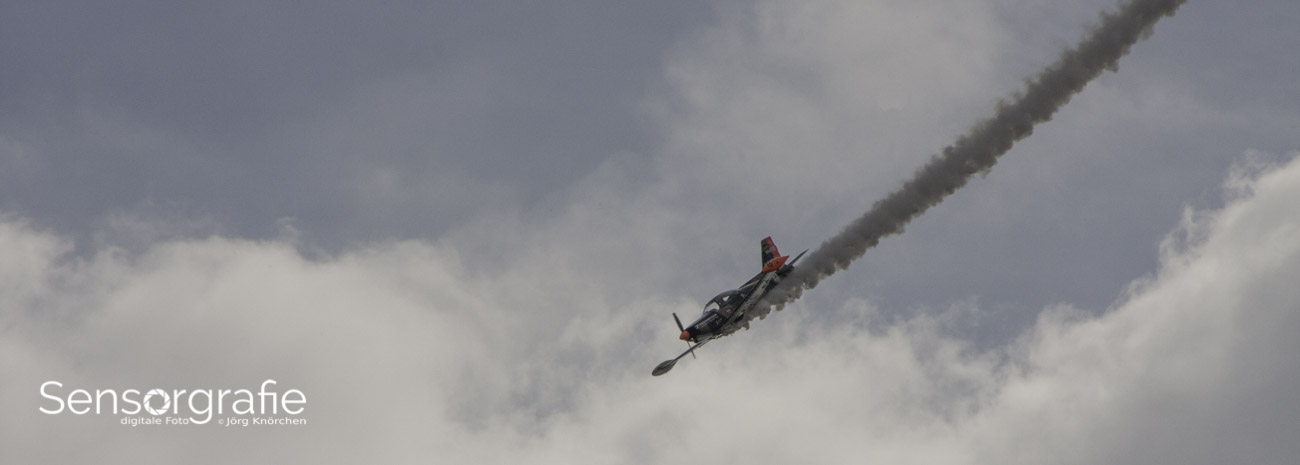
The same idea applies to movement. A cyclist, runner, bird, or moving vehicle generally benefits from space ahead of it. This is sometimes called lead room or look room. Placing the subject directly against the edge can make the photograph feel cramped unless that tension is intentional.
Large areas of low contrast can also guide attention by reducing competition. When the subject has strong color against a muted background, the contrast does much of the compositional work. A red coat in falling snow, for instance, can remain visually dominant even when the subject occupies a relatively small portion of the frame.
The direction of light matters as well. Bright negative space can pull the eye toward a subject, while darker surrounding tones can create a contained, dramatic atmosphere. During editing, modest adjustments to exposure, clarity, saturation, and local contrast can preserve this relationship without making the image look artificial.
Creating Breathing Room In Different Genres
In portrait photography, negative space can communicate personality and context. A subject positioned near one side of the frame may appear connected to the surrounding environment, while a centered figure with equal space around the head and shoulders can feel formal and stable. The best choice depends on the intended mood and the subject’s posture.
Children and animals often move unpredictably, which makes compositional space especially useful. Leave room in the direction of movement or attention, and avoid cropping close to active limbs, ears, tails, or hands unless the image is deliberately tight. Practical advice on working with young subjects and pets is available in these photographing children and pets practices.
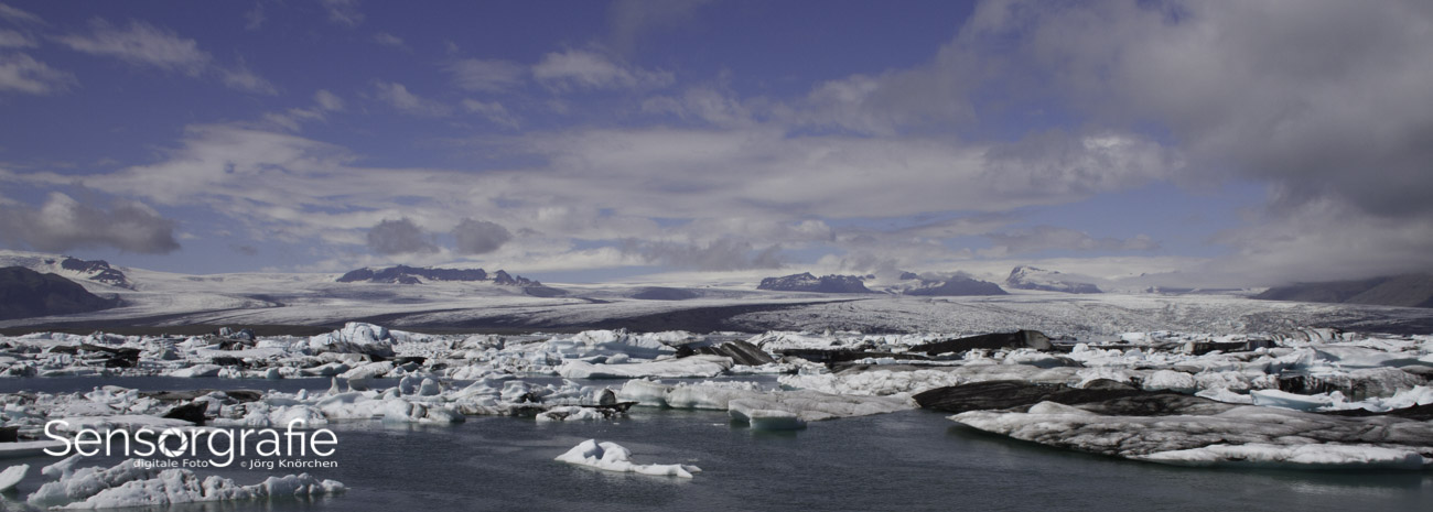
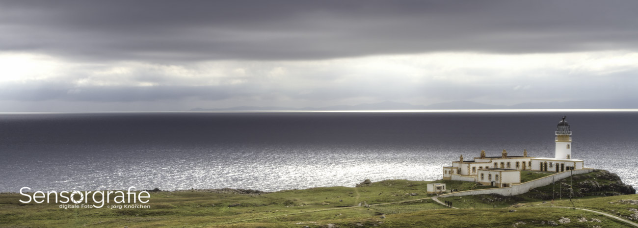
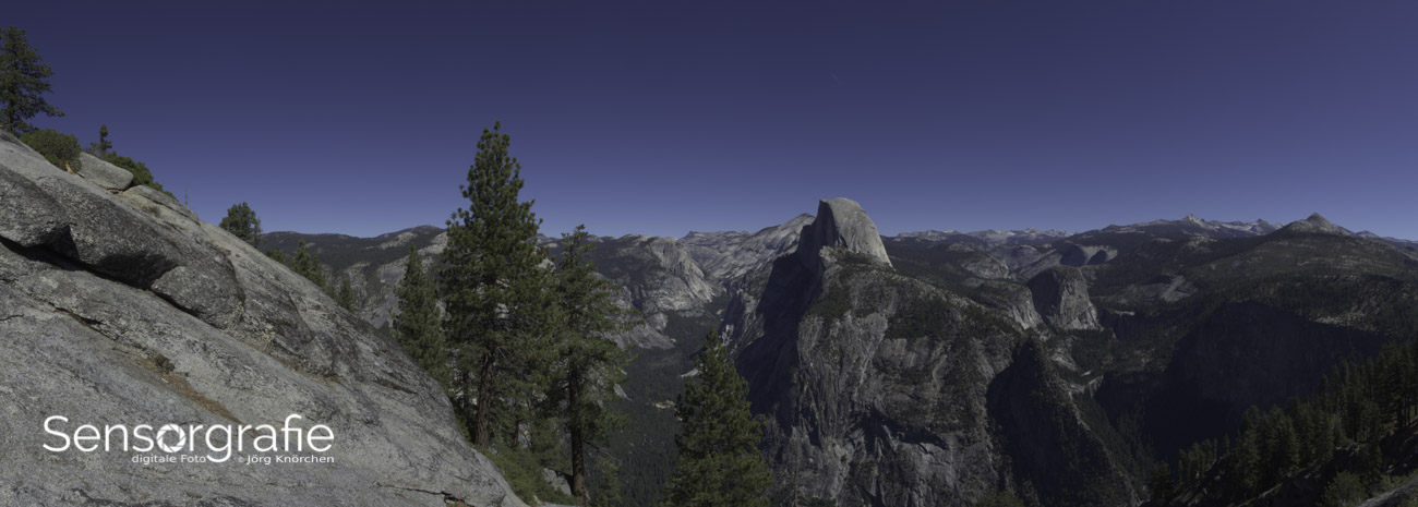
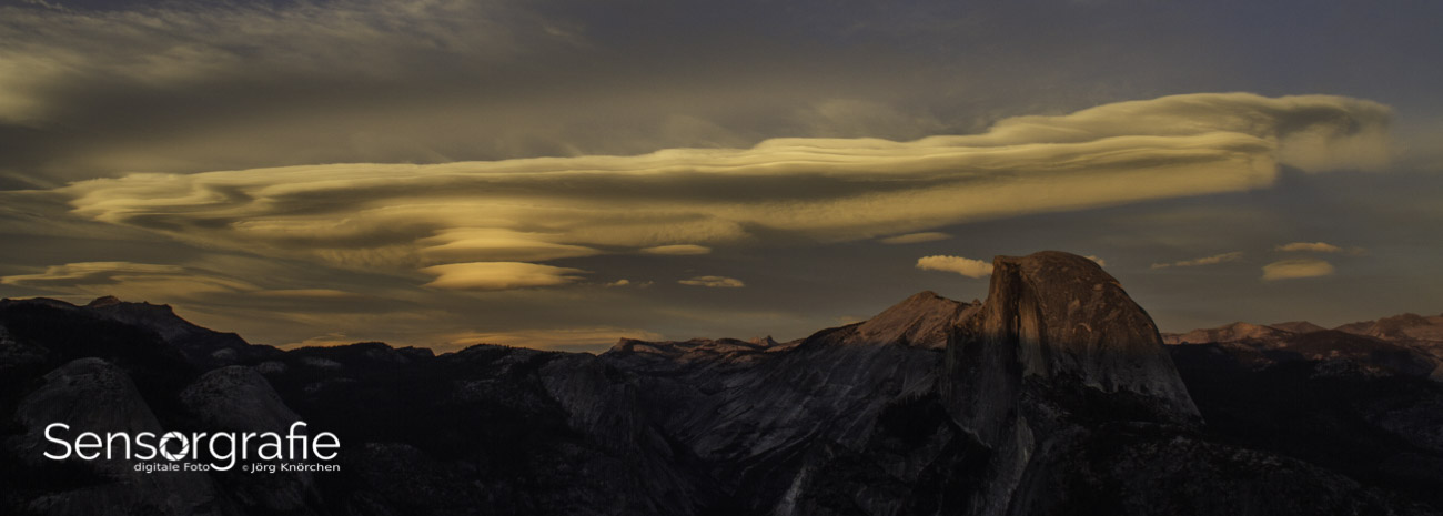
Landscape photographers can use empty sky, mist, water, snow, or sand to simplify a scene. A minimal landscape does not require dramatic mountains or unusual weather. Subtle layers, a distant tree, or a single human figure may provide enough positive space to anchor the composition.
In street and travel photography, open areas can frame a person within a larger story. A passerby crossing a sunlit wall, a lone figure beneath an architectural arch, or a small boat on still water can gain power from the surrounding environment. The negative area provides context while preserving visual clarity.
Still life and product photography use this technique for both artistic and commercial reasons. Space around an object can make a layout feel refined and provide room for text, logos, or packaging information. This is one reason simple compositions are common in advertising, editorial design, and website imagery.
Choosing Placement, Scale, And Aspect Ratio
The rule of thirds is a useful starting point, but it is not a requirement. Placing a subject near an intersection of thirds can create balance while leaving space in front of it. However, a centered subject can be highly effective when the surrounding area is symmetrical, spacious, or intentionally confrontational.
Scale strongly influences meaning. A person occupying ten percent of the frame feels very different from a person filling eighty percent. A small subject can emphasize the size of the environment, while a larger subject makes the remaining space feel like a deliberate border or atmosphere.
Aspect ratio changes the available breathing room. A wide horizontal frame is well suited to subjects moving laterally, broad horizons, and editorial layouts. A vertical frame can create a tall field of space above a subject, emphasize height, or support a portrait-oriented story. Square formats encourage centered designs and balanced margins.
Before pressing the shutter, examine the edges and corners. Distracting branches, bright highlights, signs, or partial objects can weaken an otherwise simple composition. Moving a step sideways, lowering the camera, changing focal length, or waiting for a passerby to clear the frame may improve the relationship between subject and surrounding space.
| Photographic choice |
Effect on negative space |
Useful application |
| Wide-angle lens |
Expands the environment and increases spatial relationships |
Landscapes, architecture, environmental portraits |
| Telephoto lens |
Compresses distance and isolates the subject |
Wildlife, sports, minimal scenes |
| Wide aperture |
Softens background detail and reduces visual competition |
Portraits, flowers, candid moments |
| Small aperture |
Keeps more of the open environment recognizable |
Travel, documentary, architectural work |
| Horizontal orientation |
Creates lateral room for movement or gaze |
Vehicles, walking subjects, editorial layouts |
| Vertical orientation |
Emphasizes height and upper or lower breathing room |
Portraits, trees, buildings, posters |
| Low contrast background |
Lets shape, color, or gesture dominate |
Minimalist compositions and product images |
Using Light, Color, And Texture
Negative space does not have to be white, black, or perfectly smooth. Its effectiveness depends on relative simplicity. A field of repeating grass, a foggy forest, or a wall with gentle tonal variation can support a subject when the texture does not compete with its form.
Color is one of the fastest ways to separate positive and negative space. Complementary colors create strong contrast, while analogous colors produce a quieter relationship. A blue subject against a warm beige background may feel distinct and polished; a pale subject against a similarly pale background may create a softer, more subtle image.
Light can simplify a scene in real time. Backlighting may turn a person into a silhouette against an even sky, while side light can reveal texture in the subject and leave the background subdued. Open shade is often useful for portraits because it reduces harsh background distractions and produces more consistent skin tones.
Exposure should be considered at the capture stage. A bright background can cause the camera to underexpose a darker subject, while a pale subject against a dark setting may be rendered too brightly. Check the histogram and highlights when necessary, then decide whether the visual contrast supports the story.
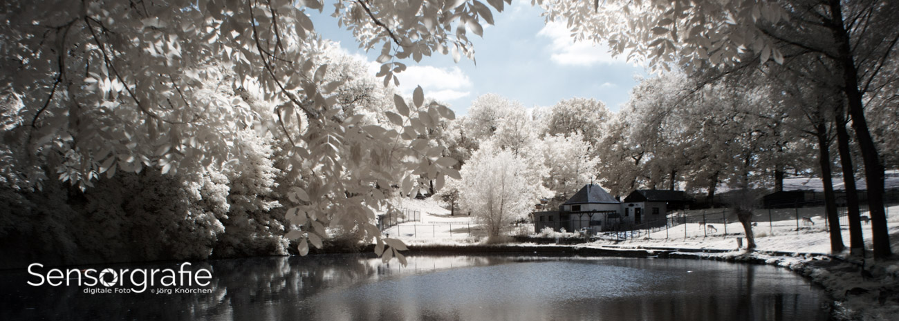
Black-and-white conversion can reveal structural relationships that color obscures. Without hue differences, the viewer responds more directly to shape, luminance, edges, and gesture. A nearly blank gray sky surrounding a dark architectural form may become more powerful after color is removed.
Avoiding Flat Or Accidental Compositions
Minimalism is not the same as removing everything interesting. A photograph with too little visual structure can feel empty in an unintentional way. The open area needs a reason to exist: it may emphasize scale, create anticipation, communicate calm, or isolate a gesture.
Look for an anchor that gives the eye somewhere to settle. This anchor may be tiny, such as a distant person, a bird, a bright window, or a single flower. Its relationship with the surrounding space should be clear enough that the viewer understands the composition rather than assuming the frame was simply incomplete.
Balance is another concern. A large subject placed close to one edge may make the image feel unstable, while a small subject in the center may seem static. Visual weight is affected by brightness, color intensity, sharpness, and shape, so a dark object can balance a broader but paler area.
Cropping offers a second opportunity to refine the design. Try several aspect ratios and examine whether the crop strengthens the subject’s direction, reduces distractions, or changes the emotional tone. Keep the original file so that alternative interpretations remain available later.
Practical Ways To Strengthen A Minimal Frame
- Move closer or change your focal length to remove competing details without cutting off important subject features.
- Leave extra room in the direction of a subject’s gaze, movement, or implied action.
- Use a low-detail background, shallow depth of field, mist, shadow, or backlight to reduce visual noise.
- Check the frame edges for bright distractions, awkward tangencies, and accidental crops.
- Review the image in both color and monochrome to see which version gives the negative space greater purpose.
Editing Negative Space With Restraint
Post-processing should clarify the relationship between the subject and its surroundings. Start with global adjustments such as exposure, white balance, contrast, and crop. Small changes may be enough to make the subject stand out while keeping the image natural.
Selective adjustments can shape attention more precisely. Increase contrast or sharpness around the subject, reduce saturation in a competing background, or subtly darken an edge that pulls the eye away. These changes work best when they remain difficult to detect.
Content-aware tools and cloning can remove small distractions from an otherwise effective frame. Use them carefully, especially in documentary, architectural, and editorial work where altering the scene may compromise accuracy. A clean composition should not depend on extensive retouching when a better camera position was available.
Noise and compression are more visible in broad, smooth areas than in detailed subjects. When lifting shadows or brightening a plain sky, watch for banding, color artifacts, and uneven gradients. Photographing in RAW format provides more flexibility for recovering tones and preserving subtle transitions.
Export settings also matter. A carefully edited minimalist image can lose its smooth tonal structure through excessive sharpening, low-quality compression, or incorrect color management. Compare the final file on the platforms where it will be viewed, since web displays and printed surfaces may render open areas differently.
Practicing The Less-Is-More Approach
A useful exercise is to photograph one subject from several distances and angles while deliberately reducing background information. Take a wide environmental frame, a medium composition with moderate breathing room, and a close version that removes most context. Compare how the subject’s meaning changes in each image.
Another exercise involves choosing a single color or shape and searching for it against quiet backgrounds. Photograph a yellow leaf on gray pavement, a person in a pale corridor, or a dark window in a bright wall. This trains the eye to recognize contrast and separation before you begin thinking about camera settings.
Try working with a fixed focal length for a day. Without the convenience of zooming, you must move your body and make more deliberate decisions about distance, scale, and perspective. This often reveals how small changes in viewpoint can transform empty areas into active parts of the composition.
Review your images later with the subject temporarily covered. If the remaining space still has a clear directional, tonal, or geometric relationship to the subject, the composition is probably working. If it feels arbitrary, consider whether a crop or a different moment would make the visual intention clearer.
Sensorgraphy’s photography resources offer a broader place to explore digital imaging, equipment, editing, and practical techniques alongside this compositional approach. Negative space becomes easier to use when it is connected to a wider understanding of light, lenses, and visual storytelling.
The strongest minimalist photographs are rarely accidental. They come from observing relationships: subject and background, movement and direction, brightness and shadow, detail and calm. Begin by slowing down before each exposure and identifying what the frame can do without. Then make the remaining elements carry the story. Capture a small series built around deliberate open space, edit it with restraint, and share the images where their quiet structure can receive attention.