How to Create a Consistent Color Palette Across Your Photography Portfolio
A recognisable colour palette gives a photography portfolio a stronger visual identity. It helps separate a considered body of work from a random collection of technically competent images, even when the photographs were made in different locations, seasons or lighting conditions. Consistency does not mean every frame must have the same tint. It means the images appear to belong to the same photographer and support the same emotional direction. Learn more about How To Photograph Silhouettes 2.
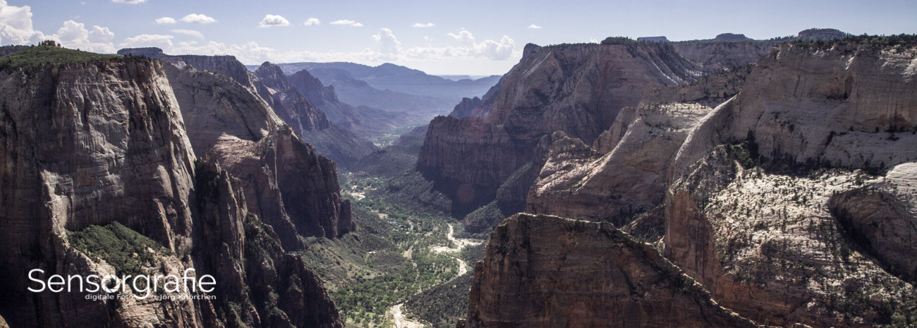
For Australian photographers, colour decisions often need to cope with intense midday sun, warm coastal light, blue shadows, red earth and the green-grey tones of native vegetation. A portrait made in Melbourne’s laneways may sit beside a landscape from the Kimberley or a night sky from regional New South Wales. A defined colour system lets those subjects coexist while preserving their individual character.
Define The Visual Mood Before Editing
Begin by deciding what your portfolio should feel like. Words such as quiet, sun-washed, cinematic, earthy, clean or nostalgic are more useful than vague instructions to “make the colours better”. Select three to five descriptive terms, then use them to judge saturation, contrast, shadow colour and skin-tone treatment.
A warm documentary portfolio might favour muted greens, gentle highlights, terracotta and cream. A commercial portrait collection could use neutral skin tones, deep charcoal shadows and a restrained accent colour. An astrophotography portfolio may lean towards cool blues and violets, but excessive blue can make every image feel artificial. The palette should support the subject rather than become a visible filter.
Create a small reference board from your strongest images. Include photographs that represent the mood, contrast and colour relationships you want to retain. You can collect them from your own archive, a colour-management application or a simple folder of exported JPEGs. Look for repeated relationships rather than identical hues: warm highlights with cool shadows, low-saturation backgrounds with vivid subjects, or natural greens paired with soft ochres.
This reference board becomes a practical editing standard. When a new image looks attractive in isolation but clashes with the rest of the collection, compare it with the board before making further adjustments. That simple pause can prevent a portfolio from becoming a catalogue of unrelated presets.
Establish A Reliable Capture And File Workflow
Colour consistency starts before post-production. Set a dependable white-balance approach and avoid allowing the camera to make radically different decisions from frame to frame. Auto white balance is convenient for fast-moving assignments, but it can produce noticeably different colour in a sequence shot under the same conditions. For controlled work, use a Kelvin value or a grey-card reference.
Shoot RAW whenever the project matters. RAW files preserve more information for correcting exposure, recovering highlights and shaping colour without introducing avoidable banding or posterisation. Record a reference frame with a grey card or colour checker when you are working on a commercial set, product session or portrait series. It is especially helpful when moving between window light, LED panels and flash.
A calibrated monitor is just as important as the camera. Without calibration, you may compensate for a display that is too bright, too cool or too saturated. Use a hardware calibrator if possible, select a sensible luminance level, and review work in the ambient light where you normally edit. A bright screen can encourage dark exports, while a warm screen may lead you to cool every image unnecessarily.
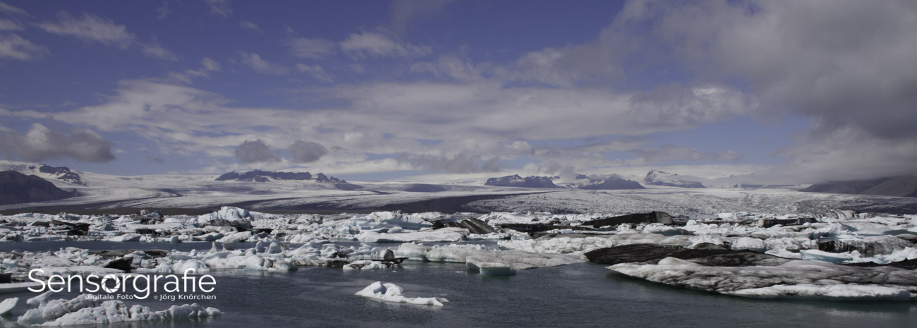
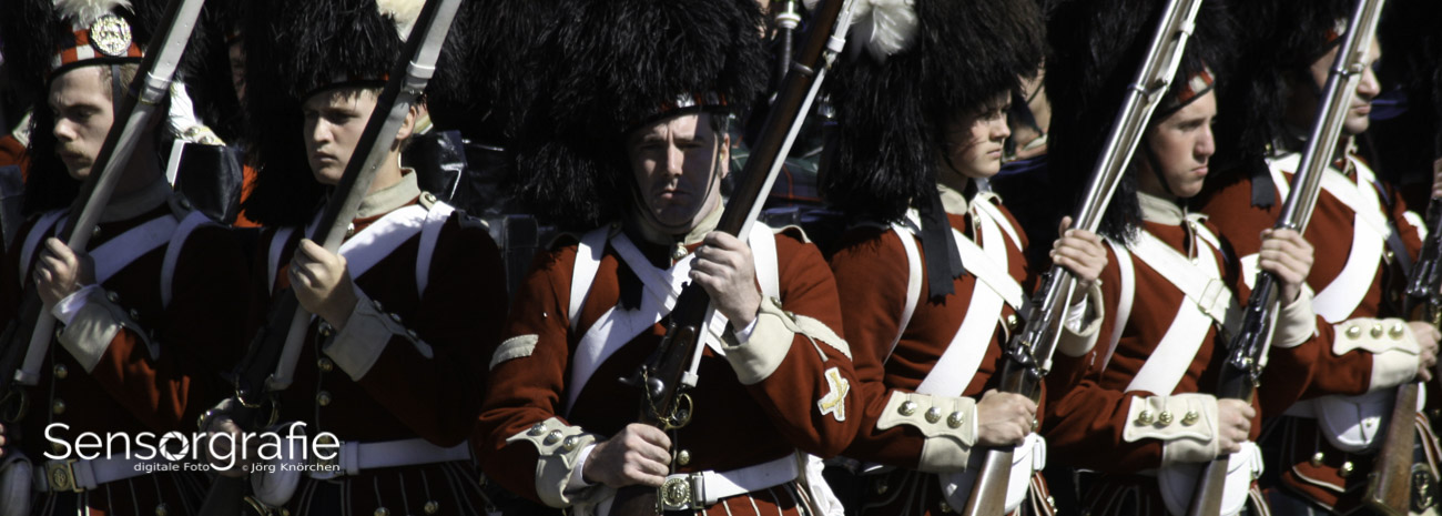
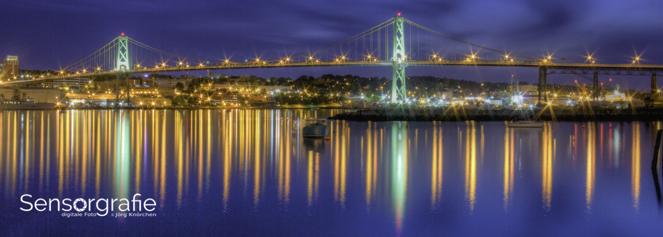
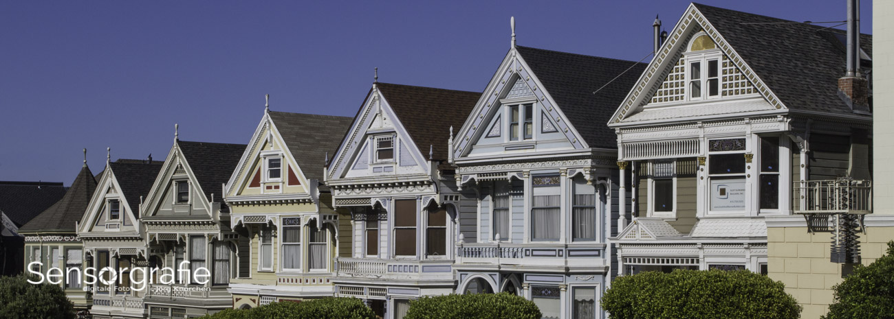
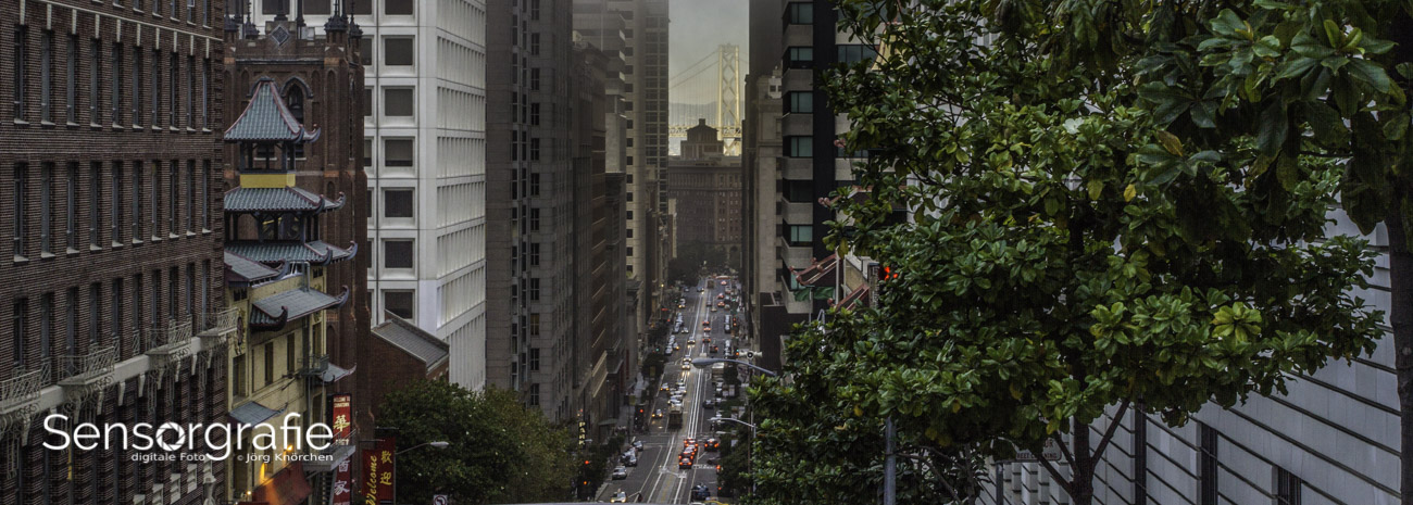
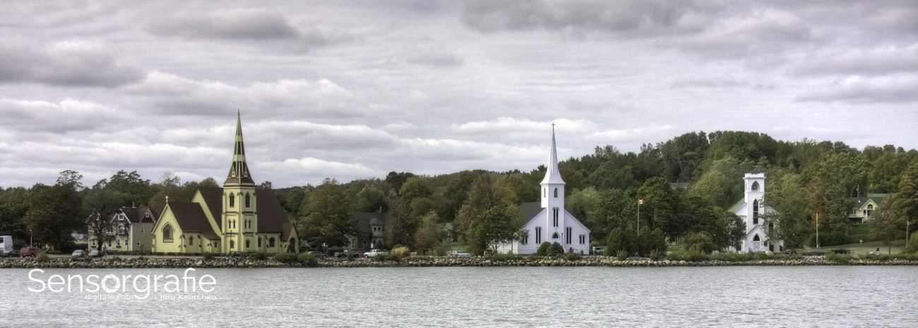
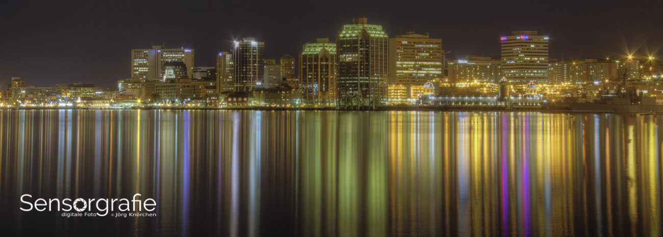
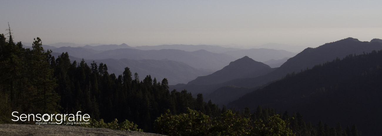
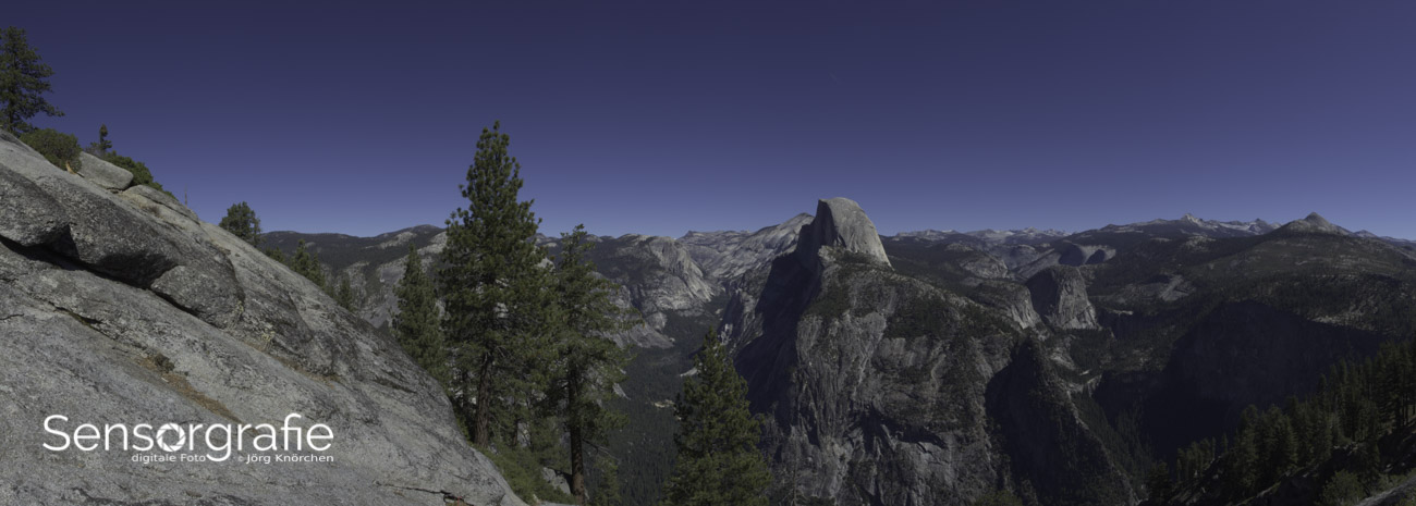
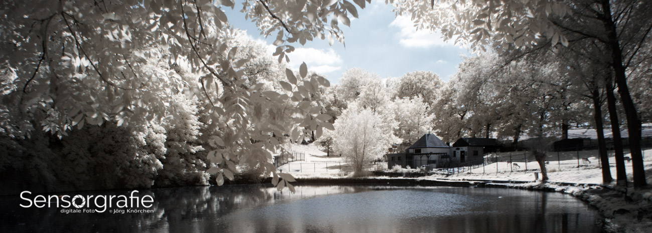
Keep colour profiles under control throughout the workflow. Adobe RGB can be useful during editing, but sRGB remains the safest choice for most websites, social platforms and general client previews. Assign and convert profiles deliberately rather than relying on software defaults. The Sensorgraphy photography site is a useful example of how a varied photography-focused publication can bring different subjects together through a coherent visual presentation.
Build A Master Look With Flexible Adjustments
Choose one or two representative images and develop a master look from them. Include a typical skin-tone frame, a landscape or environmental frame, and an image with difficult highlights if those subjects appear in your portfolio. Make broad decisions first: exposure, contrast, white balance and tonal range. Fine-tune individual colours only after the overall brightness feels stable.
Use profiles and presets as starting points rather than automatic solutions. A camera profile can influence colour significantly before any slider is moved, and a preset created for one camera or lighting situation may behave differently on another. Adjust the preset so it reflects your visual system, then save separate versions for daylight, shade, artificial light and low-light scenes where necessary.
HSL controls are valuable for shaping a palette with precision. Rather than increasing global saturation, reduce distracting colours and adjust their luminance. For example, lowering the saturation of bright green foliage can make skin, ochre walls or a red jacket stand out without looking overprocessed. Shift aqua slightly towards blue or yellow carefully; small changes can alter the perceived temperature of an entire collection.
Tone curves and colour grading can establish a relationship between highlights, midtones and shadows. A subtle warm highlight and cool shadow split may add depth, while a near-neutral grade can suit editorial or architectural work. Keep the effect restrained. If every shadow is teal and every highlight is orange, the visual treatment can become more memorable than the photographs.
Match Images Without Erasing Their Character
Once the master look is ready, apply it across a group and compare the frames together in contact-sheet or grid view. This is where inconsistencies become obvious. One photograph may have a green cast, another may have crushed blacks, and a third may appear much more saturated simply because its subject contains bright red.
Correct exposure and white balance before applying local colour changes. A warmer photograph often appears more saturated, so reducing saturation first may hide the real problem. Match the brightness of important subjects, particularly faces, because viewers read exposure differences as colour differences. For portraits, preserve believable skin before adjusting background tones.
Do not force a beach scene, a forest interior and an urban night image into identical treatment. Instead, define boundaries for the palette. Perhaps skin remains neutral to gently warm, foliage stays subdued, highlights remain creamy rather than stark white, and blues never become electric unless the scene genuinely calls for it. These rules create unity while allowing natural variation.
Pay attention to the order in which images will be viewed. A highly saturated frame can make the next photograph look dull, while a very dark image can make a normally exposed frame seem too bright. Sequencing is part of colour grading. On a portfolio page, arrange images so that shifts in temperature and intensity feel intentional rather than abrupt.
Adapt The Palette To Australian Light And Subjects
Australian light can be wonderfully clear, but it is often unforgiving. The strong sun around Perth, Adelaide or Brisbane can produce hard highlights and deep blue shadows, particularly near reflective water or pale sandstone. Instead of warming everything to counteract blue shade, recover highlight detail, soften contrast and neutralise only the areas that look unnatural.
Native landscapes offer a broad palette that can anchor a portfolio: eucalyptus greens, dry grass, iron-rich reds, pale sand and stormy coastal blues. The danger is over-saturating these colours until foliage looks fluorescent or red earth becomes orange. Use targeted adjustments and compare your edits with the original scene or a trusted reference photograph.
Urban work has different challenges. Melbourne’s laneways may contain mixed lighting from shopfronts, tungsten windows and cool street fixtures. Sydney harbour scenes can combine reflective water, bright skies and shaded architecture. In both cases, a consistent portfolio benefits from controlling the strongest colour distractions while retaining enough local atmosphere to make the location believable.
For night work, exposure blending and noise reduction can shift colour quickly. A dark-sky image from the Victorian High Country or the Northern Territory may contain subtle natural greens and magentas in the Milky Way. Excessive noise reduction or strong colour grading can turn these into blotches. A considered astrophotography workflow, including suitable astrophotography lenses, helps preserve detail before creative grading begins.
Use Contrast And Colour To Guide The Viewer
A consistent palette becomes more effective when colour hierarchy is deliberate. Choose the colours that should attract attention and reduce competition elsewhere. In a portrait, that may mean protecting warm skin and a garment while muting a bright background. In a landscape, it may mean keeping a sunset vivid while controlling green or cyan areas that pull the eye away from the horizon.
Local adjustments are useful, but they should follow a clear reason. A radial mask can brighten a subject, a brush can neutralise a distracting sign, and a selective colour adjustment can keep a product or flower accurate. Avoid stacking many masks simply because the image feels unfinished. Excessive local work often creates halos, uneven transitions and a palette that cannot be repeated across a series.
Black-and-white images can still belong in a colour portfolio if their tonal treatment follows the same visual philosophy. Soft contrast, open shadows and gentle grain may connect them to muted colour images, while harsh contrast and crushed blacks may feel like a different project. Treat monochrome as a deliberate branch of the portfolio rather than an escape from unresolved colour decisions.
Test the collection in its actual publishing environment. Review the images on a desktop monitor, a modern phone and, if prints matter, a soft-proofing setup. Social platforms may compress files and alter how fine colour differences appear. Australian clients viewing a gallery on a bright phone outdoors may perceive the work differently from a curator viewing it in a dim room, so judge the overall rhythm as well as individual accuracy.
Create A Repeatable Review And Export System
A simple review system makes colour consistency manageable. Keep a master catalogue with your original RAW files, edited masters, presets and exported versions. Name collections by project and date, and retain a non-destructive editing file when possible. This allows you to revisit an earlier series after refining your overall palette without rebuilding every image from scratch.
Before delivery, inspect the portfolio in a grid and identify the three images that feel most disconnected. Correct those first. Check white balance, exposure, shadow colour, saturation and skin tones in that order. If an image still does not fit, decide whether it needs a separate project grouping rather than increasingly aggressive edits.
| Area to check |
Consistent approach |
Warning sign |
| White balance |
Similar lighting receives a similar neutral or warm/cool treatment |
Nearby images shift noticeably between yellow, green and blue |
| Skin tones |
Natural hue and believable brightness remain priorities |
Faces become orange, pink, grey or overly desaturated |
| Saturation |
Accent colours are controlled and repeated purposefully |
Every image contains intense colour with no visual hierarchy |
| Contrast |
Black levels and highlight roll-off follow a recognisable pattern |
Some frames look flat while others appear harsh |
| Colour profiles |
Files are converted deliberately for their destination |
Colours change after export or look dull online |
| Image sequence |
Temperature and intensity transitions feel intentional |
A bright, vivid frame overwhelms the images around it |
Use these practical checks before publishing:
- Compare the strongest images in a contact sheet rather than editing them one at a time.
- Confirm that exported files use the intended colour profile, usually sRGB for web delivery.
- View the portfolio at thumbnail size to check colour hierarchy and visual rhythm.
- Recheck skin tones and neutral objects after applying any global preset.
- Keep a reference gallery so future projects can match the established visual language.
Consistency is a process of controlled decisions, not a single preset. When your capture settings, monitor, colour profile, editing choices and sequencing support the same intent, photographs from different Australian environments can feel connected without losing their individual atmosphere. The result is a portfolio with a clear signature: flexible enough for new work, stable enough to be recognised, and natural enough to keep the photographs at the centre.