How to Create a Photo Book from Your Travels: Layout and Printing Tips
A travel photo book turns a folder of images into a physical story that can be revisited years after the trip. It gives your best photographs a clear sequence, adds context through captions and maps, and creates something more satisfying than a collection of files scattered across a phone, hard drive, or cloud account.
The strongest books are planned before the first page is designed. A thoughtful edit, a consistent visual style, and a print specification suited to the story will usually matter more than an expensive camera. Whether your photographs come from a road trip through Tasmania, a weekend in Melbourne, or a long journey across Europe, the same practical principles apply.
Define the story before opening your layout software
Start by deciding what the book is about. “Our holiday in Japan” may be accurate, but it is broad enough to make editing difficult. A more focused idea might be “Quiet mornings and crowded streets in Kyoto”, “A family road trip along the Great Ocean Road”, or “Landscapes from Sydney to the Red Centre”. A clear theme helps you reject photographs that are attractive but unrelated.
Consider who will view the finished book. A family album can include imperfect snapshots, personal jokes, and photographs of people looking away from the camera. A portfolio-style travel book needs stricter editing, stronger visual variety, and fewer images overall. A gift book may benefit from captions that explain names, dates, and locations to someone who was not present.
Write a short description of the journey in a notes document before you begin. Include the route, approximate dates, memorable events, and a few details that may not be obvious in the pictures. This material can later become an opening page, chapter text, or brief captions without forcing you to reconstruct the trip months later.
Edit the photographs with rhythm and variety
A useful first edit removes obvious technical problems: accidental duplicates, badly blurred frames, closed eyes, distracting expressions, and images that are too dark to rescue. Do not try to design the book at this stage. The goal is to reduce the collection to photographs that have emotional, visual, or narrative value.
Next, group the remaining pictures into scenes. A travel sequence might move from departure and arrival to accommodation, streets, food, landscapes, people, and the return journey. Within each group, choose an establishing image, several supporting views, and a detail. A wide shot of Uluru, for example, gains context from a close photograph of textured rock, a person walking through the frame, or a record of the changing light.
Vary the pace. Several full-page landscapes in succession can feel slow, while a spread filled with small images can become noisy. Alternate wide views with portraits, architecture with details, and energetic scenes with quiet pauses. Avoid placing two nearly identical photographs beside each other unless the repetition is deliberate, such as a sequence showing movement or changing weather.
If you shoot in RAW, complete the essential adjustments before placing images in the book. Correct exposure, white balance, lens distortion, and cropping consistently across related photographs. A visual style does not require every image to look identical, but large shifts in colour or contrast can make adjacent pages feel disconnected.
Build a layout that supports the journey
Most travel books work well when they follow a simple visual grammar. Give important images more space, use smaller photographs for supporting details, and leave enough white space for the eye to rest. A full-bleed photograph can create a strong opening or closing moment, while a bordered image may suit a page with captions and location notes.
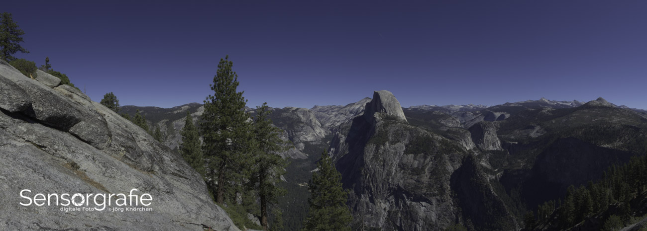
Think in spreads rather than individual pages. The left and right pages are viewed together, and the centre fold can hide part of a photograph. Avoid placing faces, signs, or important architectural details directly across the gutter. When a panoramic image must cross the fold, position the key subject to one side and ask the printer how much trim and binding loss to expect.
Keep margins and alignment consistent. A simple grid can accommodate most travel projects: one large image with two smaller images, three equal images in a row, or a full-page photograph opposite a text page. Occasional variation adds energy, but a book becomes easier to read when the underlying structure remains predictable.
Typography should be restrained. One typeface for headings and another for body text is usually sufficient. Captions can include the place, month, and a short observation, but they should not compete with the image. Use sentence case, generous line spacing, and a text size that remains comfortable in print. Test small type on paper because it often appears less legible than it looks on a bright monitor.
Match the book format to the photographs
The shape and physical finish of a book influence how your images are experienced. Portrait formats suit people, buildings, and photographs taken vertically. Landscape formats are natural for scenery and road-trip views, while a square book can provide a balanced compromise for mixed camera orientations.
Paper also changes the character of the images. Glossy stock produces strong colour and deep contrast, but fingerprints and reflections can be distracting. Matte paper is easier to view under household lighting and often feels more refined, though blacks may appear softer. Lustre or semi-gloss stock can offer a useful middle ground for a book containing both landscapes and portraits.
| Book choice |
Best suited to |
Strengths |
Points to check |
| Portrait format |
Portraits, streets, architecture |
Natural for vertical images and text |
Wide landscapes may need careful cropping |
| Landscape format |
Scenery, panoramas, road trips |
Displays broad views comfortably |
Portrait images may require extra space |
| Square format |
Mixed travel collections |
Balanced, contemporary appearance |
Can use more paper and cost more |
| Glossy paper |
Saturated colour and high contrast |
Vivid images and sharp detail |
Reflections and fingerprints |
| Matte paper |
Albums, captions, soft light |
Comfortable viewing and elegant finish |
Blacks and fine contrast may look gentler |
| Lay-flat binding |
Panoramas and full-spread images |
Minimises the gutter across a spread |
Usually costs more and may limit page choices |
Check the printer’s minimum and maximum page counts before designing. Some services charge by fixed page ranges, while others allow individual pages. Lay-flat binding can be particularly effective for a panoramic coastline or city skyline, but it may require higher-resolution files and a larger budget. Compare prices in Australian dollars and check whether GST, delivery, and cover upgrades are included.
Prepare files for accurate colour and sharpness
A photo book may look different from the editing display if the monitor is very bright or poorly calibrated. Reduce screen brightness to a realistic level and, where possible, use a calibrated monitor. Soft-proofing with the printer’s ICC profile can reveal colours that fall outside the printing process, especially intense blues, greens, and reds.
Export photographs at the resolution recommended by the printer. A practical target for many books is around 240 to 300 pixels per inch at the final printed size. Enlarging a small phone image across an entire page can produce softness, but modern smartphones may still work well when the original file is clean and the image is not excessively cropped.
Use the colour space requested by the service. Many consumer platforms accept sRGB, while professional labs may specify a different workflow. Converting files without checking the printer’s instructions can create unexpected shifts. Do not rely on a social-media download, screenshot, or messaging-app copy, since these versions are commonly compressed.
Before ordering, export a PDF or preview package and inspect every page at 100 percent. Look for clipped captions, missing images, awkward line breaks, dust spots, and important subjects too close to the trim edge. A small proof book is worthwhile for a major project. It reveals paper texture, colour balance, text size, and the effect of the binding far more clearly than a digital preview.
A practical workflow for a smoother project
Work in stages and keep a master folder separate from exported book files. A clear naming system makes revisions easier, especially when several versions of a photograph have similar filenames.
Useful steps include:
- Create folders for originals, edited photographs, book exports, and final artwork.
- Add star ratings or colour labels before choosing the final sequence.
- Record locations, dates, names, and spelling while the journey is still fresh.
- Save a second copy of the layout and back up the completed files.
- Order a proof before committing to multiple copies or a premium binding.
Australian conditions can affect both the design and the production process. Strong sunlight at places such as Bondi Beach or the Kimberley can produce deep shadows and bright highlights, so check those images carefully in print. If you are using a local lab in Sydney, Melbourne, Brisbane, or Perth, ask whether it provides paper samples and a colour profile. Delivery times may lengthen around Christmas, and a book intended as a present should be ordered well before the seasonal rush.
For photographers who want more guidance on editing and digital imaging, digital photography resources can help clarify software, equipment, and workflow decisions. The most useful reference is the one that fits your camera system, editing application, and intended print process rather than promising a universal setting.
Choose a printing service with care
Consumer photobook platforms are convenient for family albums and small print runs. Their templates, automatic image checks, and online ordering make it possible to complete a project quickly. A specialist photo lab may offer better paper, colour control, custom sizing, and more binding options, although the workflow usually requires more preparation.
Ask the printer how it handles colour management, image sharpening, trim, and safe areas. Some systems apply automatic corrections that can undo adjustments you made yourself. Disable those corrections if your files have already been edited carefully. If the service does not explain its sharpening or colour policy, order a small sample before producing a large or expensive book.
Request paper samples when available. Australian online prices can look attractive until shipping and GST are added, while an overseas service may have longer delivery times and complicated returns. A local supplier can be easier to contact if a cover arrives damaged or a page is printed incorrectly. Check the replacement policy, packaging, dispatch estimates, and whether rural delivery attracts an additional fee.
Think about quantity as well as price. One premium copy may suit a personal archive, while several standard copies may be better for relatives or travel companions. A linen, cloth, or hardback cover can make the book more durable, but the photograph itself should remain the main focus. Add a restrained title and date rather than filling the cover with multiple images and decorative effects.
Finish the book with useful details
The final pages can provide a satisfying sense of place. Add a simple route map, a short list of locations, a packing note, or a paragraph about the most memorable day. These elements work best when they support the photographs rather than turning the album into a full travel diary.
Proof captions carefully. Check local place names, accents, dates, and names of people. Australian locations can have Indigenous names with specific spelling and pronunciation conventions, so verify them through a reliable source. If a book includes Aboriginal or Torres Strait Islander places, stories, or cultural material, provide respectful context and avoid treating significant sites as mere scenery.
A strong ending is often quieter than the opening. Use a final landscape, an empty road, a view from the accommodation, or a small detail that recalls the journey. Add the travel dates and photographer’s name discreetly if the book may become part of a family archive.
Once the printed copy arrives, inspect the cover, page order, colour, binding, and image sharpness in daylight. Keep the book upright and away from damp areas, direct sun, and extreme heat. Store the original project files and exported photographs separately so the story can be reprinted later, adapted into a smaller gift edition, or expanded when the next journey provides new chapters.