How to create a custom watermark for your images
A watermark can identify your photography, discourage casual image theft, and make shared work easier to trace. Used carefully, it becomes part of your visual identity rather than an obstruction placed over the subject. The strongest results usually come from a restrained design, consistent placement, and export settings suited to the way an image will be viewed.
A custom watermark may be as simple as a name, initials, or website address, or it may combine lettering with a small logo. The right choice depends on your genre, audience, and publishing habits. A wedding photographer may need a discreet signature, while a stock or editorial photographer may prefer a more visible copyright notice.
The process is accessible with almost any modern image editor. You can create a reusable transparent graphic, apply it manually to selected photographs, or build an automated preset for large batches. Before adding anything, decide what the watermark should accomplish and how much of the photograph it can cover without weakening the image.
Decide what your watermark needs to communicate
Start with the essential information. Most photographers use their name, business name, initials, or a web address. A short mark is easier to read at small sizes and creates less visual competition with the photograph. If your full business name is long, consider using a symbol alongside a shortened name instead of squeezing every word into the design.
Think about where the image will appear. A portfolio image on your own website can use a subtle signature because your site already provides context. A preview posted to social media may need a more noticeable mark if it is likely to be downloaded, cropped, or reposted. Images supplied to clients often require a separate proof watermark that is removed from the final files.
Your watermark should support recognition across different subjects. A decorative script may suit portraits or weddings but become difficult to read over detailed landscapes. A clean sans-serif wordmark is versatile, while a monogram can work well when your name has several words. Test the concept on bright, dark, smooth, and busy backgrounds before treating it as finished.
A watermark is not a replacement for copyright registration, embedded metadata, licensing terms, or sensible file delivery. It can be removed from some images, especially when it sits near an edge. Its main benefits are identification, attribution, and deterrence, so design it for those purposes rather than assuming it can provide complete protection.
Build a visual identity that stays readable
Create the watermark on a transparent canvas, preferably larger than the size at which you expect to use it. This gives you flexibility when exporting high-resolution files and reduces the risk of soft edges. Save an editable master in the native format of your software, then export a transparent PNG for routine use. If your editor supports vector artwork, retain an SVG or other vector version as well.
Typography deserves particular attention. Choose a typeface with recognizable letterforms and enough spacing to remain legible when reduced. Thin strokes can disappear against textured backgrounds, while elaborate flourishes may turn into visual noise. Adjust tracking, line spacing, and the relationship between your name and any icon until the mark feels balanced at both thumbnail and full-screen sizes.
Color and opacity determine how strongly the watermark competes with the photograph. White and black versions cover most situations, but a muted brand color may be useful for a controlled portfolio. An opacity between roughly 20 and 50 percent is often a practical starting point for a discreet overlay. The correct setting varies with the image, so judge it at the actual display size rather than relying only on a zoomed-in editing view.
A logo should remain recognizable without depending on tiny details. Remove unnecessary outlines, shadows, and gradients if they make the mark harder to place. Keep a light version, dark version, horizontal version, and compact version when your work appears across websites, prints, proof galleries, and social platforms.
Create the watermark in your editing software
In Photoshop, build the design as a separate document with a transparent background, then save it as a PNG or use it as a reusable layer. You can place the file over an image, transform it proportionally, reduce opacity, and save the result as an action for repeated work. Photoshop also supports batch processing through actions and droplets, which is useful when a complete gallery requires the same treatment.
Lightroom Classic offers a watermark editor that can apply text or graphic marks during export. This is convenient for photographers who already organize and deliver images there. Define the font, size, color, opacity, position, and inset once, then save a preset. Because the watermark is added during output, your original photographs remain clean and can be exported again for other purposes.
Affinity Photo, Capture One, and many mobile editing applications provide similar options, although the names and automation features differ. GIMP can create a transparent watermark file and use layers or scripts for repeatable placement. The specific software matters less than preserving an editable original and separating the watermark from the image data until the final export.
When creating a logo-based mark, check that transparency is genuine. A white background accidentally saved into the file will produce an unwanted rectangle over the photograph. Zoom out, place the graphic over several test images, and inspect the edges for halos. A clean transparent asset is the foundation of a professional image watermark.
Compare placement and application methods
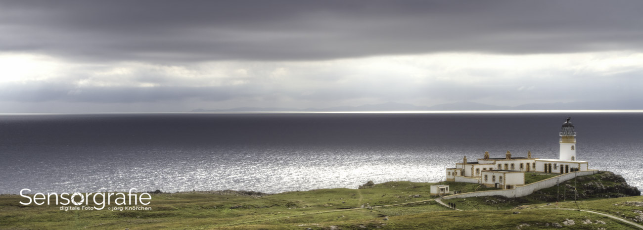
There is no universal location that works for every photograph. A lower corner is unobtrusive and familiar, but it is also easy to crop away. A mark placed closer to the visual center is harder to remove casually, yet it can distract from the subject. Many photographers use corner placement for portfolio images and a more central, translucent treatment for proof galleries.
Consider the subject’s composition before applying a fixed rule. Avoid faces, important gestures, fine architectural details, and areas where the watermark could be mistaken for an object in the scene. Placement presets can still be useful, but review every image in a batch and move the mark when it interferes with the story or balance.
| Method |
Best use |
Main advantage |
Main limitation |
| Lower-corner logo |
Portfolio and social media |
Quiet and familiar appearance |
Easy to crop away |
| Centered translucent mark |
Client proofs and previews |
Harder to remove through simple cropping |
More visible over the subject |
| Repeating pattern |
Large proof galleries |
Strong deterrence across the frame |
Can reduce viewing comfort |
| Signature or initials |
Personal branding |
Distinctive and artistic |
May be difficult to read |
| Website or business name |
Commercial promotion |
Directs viewers to your work |
Can look crowded if too long |
| Metadata-only credit |
Archival originals and licensed files |
Does not alter image appearance |
Invisible to most casual viewers |
For a consistent workflow, establish a few presets instead of forcing one watermark onto every file. A small corner logo may suit a 1,600-pixel web image, while a proof gallery may need a larger central mark. Name presets by purpose, such as “web portfolio,” “client proof,” and “social preview,” so the correct option is easy to select during export.
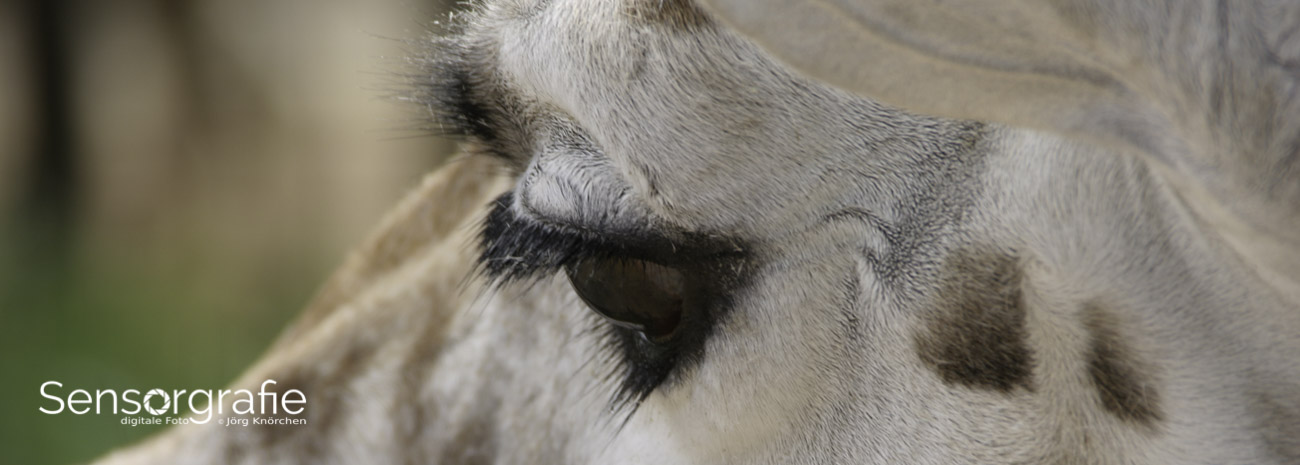
Photographers working across genres can refine these choices by studying how images are viewed at different sizes. Detailed subjects, including close-up work, leave less empty space for overlays; practical ideas for making strong close-up photographs appear in this macro photography guide. The same principle applies to watermarking: preserve the visual detail that gives the image its value.
Apply the mark without damaging image quality
Export a watermarked copy rather than flattening or overwriting your original. Keep the RAW file, layered master, and clean high-resolution export safely organized. The watermarked version should be treated as a derivative made for a particular destination, whether that is a website, online gallery, email preview, or social network.
Match the watermark workflow to the final dimensions. A mark that looks subtle on a large monitor may vanish when the platform resizes the image, while a mark designed for a small phone display may dominate a full-resolution file. Resize the image first, then judge the watermark at 100 percent of its final pixel dimensions. This is especially important when using batch presets.
JPEG quality, sharpening, and color space also influence the result. For most web publishing, sRGB is the safest color profile, and moderate JPEG compression helps keep file sizes manageable. Inspect fine text and logo edges after export, because compression can produce jagged outlines or fuzzy transparency. If the image is destined for print, create a separate file rather than enlarging a small web export.
Add copyright and contact information to the metadata when appropriate. IPTC fields can include the creator, copyright notice, usage terms, and website. Metadata is less visually intrusive and remains valuable for professional delivery, though some platforms strip it during upload. Combining metadata with a tasteful visible watermark provides stronger attribution than relying on either method alone.
Review the mark across real-world images
Test the design on a small representative set before applying it to hundreds of files. Include a high-key portrait, a dark scene, a photograph with a plain background, and one with dense texture. Also test both horizontal and vertical compositions. These examples reveal whether the text disappears, creates distracting contrast, or lands in an awkward position.
Check the watermark on a phone, tablet, and desktop display if your audience uses all three. Review it in a grid of thumbnails as well as in a larger image viewer. A watermark that appears elegant on one file may seem oversized when several marked images are viewed together. Consistency is important, but visual judgment should take priority over mechanical uniformity.
Ask whether the mark can be understood quickly. If a viewer must zoom in to identify the name, it is too small for branding. If the eye notices the watermark before the subject, reduce its size, opacity, or contrast. A useful test is to look away from the image briefly and then return to it; the photograph should remain the first thing that attracts attention.
Update your watermark when your brand, website, or business name changes, but avoid redesigning it so often that older work becomes disconnected from your current identity. Keep dated versions of your assets and presets. This makes it possible to reproduce previous client galleries or re-export older projects accurately.
Establish a reliable watermarking routine
A repeatable process prevents rushed decisions at the end of an editing session. Create a dedicated folder for watermark assets, presets, and exported variations. Record the intended size, opacity, and placement for each use case. If more than one person handles your image delivery, document the workflow so the visual standard remains consistent.
Use these practical rules as a starting point:
- Keep an untouched original and apply the watermark only to an exported copy.
- Prepare light, dark, compact, and wide versions of the mark.
- Review placement on every image that contains an important edge or subject.
- Use metadata and licensing information alongside visible attribution.
- Recheck exported files at their final display size before publishing.
Automation is valuable when the input files have similar dimensions and compositions. For varied galleries, use automation for the first pass and perform a manual quality check afterward. A few minutes of review can catch a mark placed across a face, a logo with the wrong color, or an export that has overwritten a clean file.
Your website can also reinforce the identity communicated by the watermark. Keep the linked destination current, easy to remember, and consistent with the name shown in the image. A photographer’s broader digital photography resource can provide a useful home for galleries, services, equipment information, and contact details when viewers want to find the creator behind a shared photograph.
A well-made watermark should make attribution easier while respecting the image itself. Start with a simple design, test it across real photographs, and save presets that match your publishing needs. Once the process becomes part of your export routine, each shared image can carry a clear, controlled trace of its creator without losing the qualities that made it worth seeing. Add the finished mark to your next carefully edited gallery and refine the settings from actual viewing results.