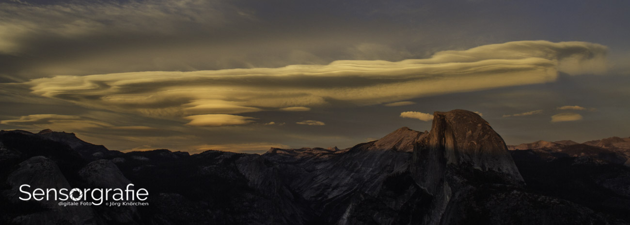
Building a cinematic mood in still photography with colour theory
Every still image carries an unspoken emotional script written in pigment and light. The film industry has long understood this, spending millions on colour science to shape how a viewer feels when the curtains rise. Photographers can borrow the same toolkit, and the results feel less like a filter and more like an intentional shift in mood. Understanding how hue, saturation, and luminance interact with storytelling turns a snapshot into something with narrative weight.
What surprises many beginners is that colour choices made before pressing the shutter matter just as much as anything done at the editing desk. From the rust-red soils of the Kimberley to the cool wash of dawn over Sydney Harbour, the Australian landscape itself offers a ready-made cinematic palette. Photographers across Brisbane, Perth, and Hobart have already begun experimenting with these ideas, treating colour not as decoration but as a structural element of composition.
What makes a frame feel cinematic
A cinematic look is recognisable in the first half-second of viewing, often before the viewer can articulate why. Common threads include a slightly desaturated mid-tone range, lifted shadows that retain detail rather than crushing to black, and a bias toward warm highlights paired with cool shadows. The teal-and-orange relationship found in countless feature films is one variation, but it is far from the only path. Earthy browns with cyan-blue accents, muted greens against amber skin tones, and high-contrast monochrome with a single colour bleed all qualify under the same family of intentions.
The comparison below outlines several cinematic styles and the technical decisions that produce each. Treat it as a starting map rather than a recipe, since the most compelling work always bends these conventions to fit the story being told.
| Style |
Dominant hues |
Shadow tone |
Highlight tone |
Mood suggestion |
| Hollywood blockbuster |
Teal and orange |
Cool teal |
Warm amber |
High stakes, adventure |
| European drama |
Desaturated olive |
Soft charcoal |
Cream |
Contemplative, grounded |
| Vintage film |
Faded reds and yellows |
Warm brown |
Pale peach |
Nostalgia, memory |
| Neo-noir |
Deep blues and reds |
Near black |
Saturated red |
Tension, mystery |
| Naturalistic documentary |
Earthy ochres |
Neutral grey |
Soft white |
Authentic, observational |
Once the patterns are recognised, they can be used deliberately. The trick is to focus on relationships rather than absolute colours, because the eye reads harmony through contrast. A teal shadow only sings when paired with a warm highlight, and a faded red register depends entirely on what sits beside it.
Planning a palette before you lift the camera
Pre-visualisation separates the photographer who stumbles upon a mood from the one who engineers it. Begin with a colour story written in plain language: dusty blue and ember gold for a story about distance, or muted sage and bone white for a quiet domestic scene. Writing the palette down commits the brain to notice opportunities that fit the plan. Storyboards, mood boards, or even a quick reference photo pulled from a film still help anchor the vision.
Location scouting carries enormous weight. A shooter planning a desert story in Australia might lean into the iron-rich red of the MacDonnell Ranges near Alice Springs, pairing the sand with denim-blue wardrobe and props. A coastal portrait session along the Mornington Peninsula could draw on slate-grey water and bleached driftwood for a melancholic register. Even in urban settings, the graffiti-saturated laneways of Melbourne provide a free palette of saturated oranges, electric blues, and acid greens that already feels like a film poster.
Wardrobe and styling reinforce the chosen scheme. Avoid introducing accidental colours through bags, sunglasses, or backgrounds that fall outside the chosen family. When shooting lifestyle or family work in Sydney's eastern suburbs, ask clients to wear tones that sit inside the planned wheel. The discipline sounds rigid but quickly becomes invisible, allowing the photograph itself to feel cohesive rather than curated.
Lighting choices that reinforce a cinematic palette
Light is colour's closest companion. The same scene can shift from romantic to menacing with a forty-degree rotation of the key light. Side lighting carves texture into subjects and pushes shadow colour into the frame, while flat front lighting washes out the very tonal range that cinematic palettes rely upon. Golden hour in Australian summer delivers roughly twenty usable minutes, which makes timing as crucial as composition.
The blue hour offers a counterweight that few other moments can match. In coastal cities like Wollongong or Cairns, photographers chase this window for its quiet cyan cast, which automatically installs a cool foundation under any warm subject. Overcast conditions in Tasmania's south work similarly, producing a soft pearl-grey light that flatters skin while preserving shadow detail for later grading.
Practical lighting inside the frame matters as much as the source itself. A warm tungsten lamp, a neon street sign, or even a red brake light from a passing car becomes a coloured accent that ties the palette together. Sydney's Vivid festival turns the harbour into a masterclass in this principle, projecting saturated magenta and electric blue across the Opera House sails. Photographers who study those scenes quickly learn how a single coloured highlight can rewire the emotional register of an entire frame.
Post-processing for cinematic colour
Post-production is where the carefully planned palette becomes a photograph. Start with a calibrated monitor, because every cinematic decision downstream depends on trustworthy colour. Adjust white balance first, then build contrast through curves or a tone curve rather than a simple contrast slider. Lifting the lower end of the curve and gently rolling off the upper highlights mimics the response of motion picture film.
Split toning is the next layer. Push a hint of teal into the shadows and a whisper of amber into the highlights, then back off until the effect becomes subliminal. Working in LAB colour space lets you isolate saturation on the A and B axes without affecting luminance, which preserves skin tones while pushing background drama. Many photographers find the hue and saturation panel in Photoshop or the colour grading tools in Capture One sufficient for the work, while others prefer dedicated platforms like DaVinci Resolve, which was designed for film work and translates beautifully to stills.
For those wanting a deeper exploration of how colour shapes photographic outcomes, the review on why you should consider colour-managed workflows offers a useful starting point. Editors new to grading often benefit from learning how a colour-managed pipeline keeps adjustments predictable, so the cinematic look survives the trip from screen to print or web.
Working with the colour wheel in practice
Hue theory provides the grammar for all these decisions. Complementary pairings, such as blue and orange or red and cyan, deliver maximum vibrancy and pull the eye toward the subject. Split-complementary schemes soften this tension while keeping energy high, replacing a direct complement with the two hues flanking it on the wheel. Analogous palettes, built from neighbours on the colour circle, feel calmer and more atmospheric, which suits landscape work in places such as the Blue Mountains or the Daintree rainforest.
Practical application begins with identifying the dominant background hue, then selecting wardrobe and accent colours that relate to it through one of these schemes. A portrait against a brick wall reads warmer when paired with denim and shadow teal; a portrait against eucalyptus foliage looks more balanced when the subject wears terracotta or soft rust. Choosing the relationship first, then choosing the specific hues within it, gives every frame a clear logic that viewers feel even when they cannot name it.
Temperature also plays a hidden role in these relationships. Warm subjects feel warmer when surrounded by cool tones, and cool subjects read as icy when framed by amber light. Australian photographers often exploit this by scheduling beach sessions in the hour before sunset, when ambient warmth meets the first hint of cool sky. The result is the kind of layered temperature palette that defines feature-film cinematography.
Bringing it all together in real scenes
A complete cinematic workflow reads like a three-act structure: choose the story's emotional register, lock in a palette and lighting scheme that supports it, then refine the colour through post-production. Skipping any of these stages tends to produce flat, generic results, because no filter can rescue a frame whose underlying light and colour choices pull in different directions.
Practise the method on familiar territory before committing it to paid work. A weekend walk through Brisbane's South Bank parklands, an afternoon at St Kilda pier, or a sunrise session at Uluru all offer rich colour material that rewards slow study. Shoot the same subject at different times of day, in different weather, and with different wardrobe accents, then compare the files side by side. The differences are usually larger than expected, and the lessons stick far longer than any tutorial.
For photographers ready to extend this approach into a broader creative practice, the https://sensorgraphy.net/ home page gathers articles, software reviews, and workshop listings under a single roof. Building a cinematic vocabulary takes time, but every frame graded with intention brings a viewer one step closer to feeling the photograph rather than simply seeing it.