How to photograph textures and patterns for abstract art
Texture and pattern photography turns familiar surfaces into visual subjects. Peeling paint, rusted metal, cracked pavement, folded fabric, tree bark, and reflections can lose their everyday identity when photographed closely. Lines become rhythm, color becomes structure, and small irregularities create an image that feels closer to painting than documentation.
The strongest abstract photographs usually begin with careful observation rather than expensive equipment. A wall can provide dozens of compositions depending on the direction of light, the distance from the surface, and the portion selected. The goal is to recognize visual relationships—repetition, contrast, balance, interruption, and scale—and then frame them with intention.
Digital cameras, mirrorless bodies, smartphones, and compact cameras can all produce compelling results. Resolution helps when fine detail matters, but control over focus, exposure, light, and composition matters more. The photography resource at Sensorgraphy also offers useful context for photographers exploring digital imaging, equipment, and creative technique.
See ordinary surfaces differently
Begin by slowing down in places that usually receive little attention. Industrial areas, old buildings, markets, workshops, gardens, and construction sites often contain layered surfaces with strong graphic qualities. Look for repetition in bricks, wires, tiles, windows, corrugated metal, or rows of leaves. Then search for imperfections that interrupt the pattern: a missing tile, a scratch, a stain, or a change in color.
Texture becomes more expressive when you examine it at several distances. From far away, a weathered door may create a broad field of muted color. From a few centimeters away, its grain, flaking finish, and shadows may become the entire subject. Make several test frames while moving closer, stepping back, and changing the angle of view. This process reveals whether the image depends on recognizable context or becomes stronger when that context disappears.
Try to separate visual information from the object itself. Ask whether a surface has a dominant direction, a repeated beat, or a visual tension between order and disorder. A pattern does not need to fill the frame perfectly. A small interruption can establish a focal point and prevent the photograph from feeling mechanically repetitive.
Build a controlled shooting setup
Abstract surface photography benefits from a stable camera position. Use a tripod when working indoors, photographing at slow shutter speeds, or making a sequence of highly consistent frames. A tripod also encourages deliberate composition, especially when the subject contains parallel lines or geometric edges that need careful alignment.
Clean the lens and inspect the surface before shooting. Dust, fingerprints, and stray fibers become prominent in close-up work, particularly when a small light source produces hard shadows. If the subject can be moved, place it on a neutral background and rotate it slowly. This is useful for fabric, paper, leaves, food, painted materials, and small found objects.
Frame the subject through the viewfinder rather than relying exclusively on autofocus and automatic exposure. Edge detail matters in abstract compositions, so check the corners for distracting gaps, bright spots, or accidental lines leading out of the frame. A square or vertical crop may work better than the camera’s native aspect ratio, but leave enough space around the subject to allow flexible cropping later.
A macro lens is valuable for fine surface detail, yet it is not essential. A standard zoom, a short telephoto lens, extension tubes, or a close-focusing compact camera can all produce useful images. The best choice depends on the scale of the subject and whether you want a flat, graphic appearance or visible depth across the surface.
| Visual goal |
Useful approach |
Detail to watch |
| Fine surface detail |
Macro lens or close-focusing lens |
Shallow depth of field and focus placement |
| Flat graphic pattern |
Camera parallel to the surface |
Uneven edges and perspective distortion |
| Strong relief and shadows |
Side lighting at a low angle |
Highlights that lose texture |
| Repeated geometric forms |
Tripod and careful alignment |
Converging lines and tilted horizons |
| Soft organic texture |
Diffused window or overcast light |
Low contrast and muted separation |
| Layered abstract color |
Multiple exposures and cropping |
Unwanted recognizable context |
Choose camera settings with intention
Focus is one of the creative controls in close-up abstract photography. A wide aperture can isolate a ridge, fiber, or painted mark while allowing surrounding detail to dissolve into soft shapes. A narrower aperture keeps more of a textured plane sharp, which is often preferable for repeating patterns or images intended to feel graphic.
Depth of field is affected by aperture, camera distance, and focal length, so changing one setting can alter the entire visual impression. A useful depth of field guide explains how these factors interact in practical photography. For a broad surface, focus stacking may be worthwhile when you need sharp detail from front to back, while a deliberately shallow focus can create a more dreamlike abstract effect.
Use the lowest practical ISO when the scene is well lit, particularly if the final image will be printed. However, moderate noise is not always a flaw; it can add a grain-like quality to monochrome or low-light work. Modern cameras tolerate higher ISO settings well, and a slightly noisy image is usually preferable to a blurred frame caused by an unnecessarily slow shutter speed.
Shoot RAW when possible. The format preserves more information in shadows and highlights and gives you greater control over color, contrast, and white balance. If you work with a smartphone, enable its highest-quality capture mode and avoid excessive digital zoom. Move physically closer whenever possible, since cropping a detailed texture from a high-resolution original generally produces a cleaner result.
Shape texture with light
Lighting direction determines whether a surface appears smooth, rough, flat, or deeply ridged. Side light is often the most effective starting point because it creates small shadows along raised areas. Place a lamp, flashlight, or window to one side of the subject and observe how the relief changes as you move the source. A slight adjustment can turn an uninteresting surface into a pattern of dramatic lines.
Front lighting reduces shadows and can produce a clean, poster-like image. This works well for color fields, stains, painted surfaces, and regular geometric patterns. Backlighting can reveal translucency in paper, fabric, leaves, plastic, and thin layers of peeling material. Reflected light from a white card or wall softens contrast and helps preserve subtle detail in highlights.
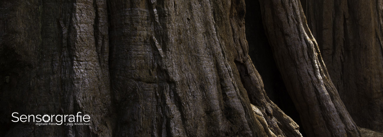
Hard light creates crisp edges and pronounced texture, while diffused light gives a quieter, more continuous appearance. Do not assume that bright sunlight is always best. Overcast conditions can reveal delicate tonal changes in stone, bark, and fabric, while direct sunlight may flatten color through overexposure. Bracketing several exposures is useful when a surface contains both pale highlights and dark recesses.
Color temperature also changes the emotional character of an abstract photograph. Warm light can make rust, wood, and paper feel earthy, while cool light emphasizes metal, glass, and blue-gray shadows. Set a fixed white balance when making a consistent series, or deliberately shift it during RAW processing to create a coherent color interpretation rather than a literal record.
Compose with rhythm and visual tension
Patterns invite repetition, but repetition alone can become static. Search for variation in scale, direction, density, and color. A row of similar forms becomes more engaging when one element is bent, broken, darker, or partially hidden. This interruption can serve as the visual anchor of the image without becoming an obvious central subject.
Use the edges of the frame actively. Lines that run parallel to an edge can create stability, while diagonals add movement. A crop that cuts through repeated forms may suggest that the pattern continues beyond the photograph. Conversely, leaving a narrow margin around a shape can make it feel isolated and architectural.
Symmetry produces order and calm, but slight misalignment often feels more organic. Rotate the camera a few degrees, change your viewpoint, or shift the frame until the relationship between lines feels intentional. For layered textures, look for a balance between dense and open areas. Empty space is especially valuable because it gives detailed regions somewhere to breathe.
Monochrome processing can clarify shape when color distracts from structure. It works particularly well with wood grain, concrete, shadows, and weathered surfaces. Before converting an image, consider whether its color relationships are part of the subject. Complementary hues, subtle gradients, and small areas of vivid color can provide the visual energy that texture alone may lack.
Refine the image without losing its surface
Post-processing should strengthen the visual idea established during capture. Start with exposure, white balance, and tonal balance before applying clarity or sharpening. Heavy clarity can create harsh halos around edges, while excessive texture enhancement may make a natural surface look artificial. Apply these controls selectively and inspect the image at both full size and final display size.
Cropping is one of the most powerful tools for abstract work. Remove recognizable corners, distracting highlights, or areas that weaken the rhythm. Try several aspect ratios, including square, panoramic, and narrow vertical crops. A single original frame may contain multiple finished compositions, each with a different emotional effect.
Color grading can transform the same texture into distinct interpretations. Reduce saturation for a subdued, tactile image; increase contrast between neighboring hues for a bold graphic result; or use a limited palette to create visual unity across a series. Curves, selective color adjustments, and local masks generally provide more control than applying a strong preset.
Consider rotating or mirroring the image during editing. A surface photographed from above may become more ambiguous when turned sideways, and a reflection may gain stronger balance when flipped. These changes are legitimate creative decisions in abstract photography, provided they serve the composition rather than disguise technical problems.
Develop a repeatable field practice
A consistent process helps you notice opportunities and produce a coherent body of work. Carry a small camera or phone, photograph under different weather conditions, and return to the same locations as surfaces change. Paint fades, water leaves marks, shadows move, and construction materials gradually acquire new layers of character.
Use this practical checklist before pressing the shutter:
- Examine the subject from close, medium, and distant viewpoints.
- Check the corners and edges for distracting lines or bright areas.
- Decide whether the image needs shallow focus or broad surface sharpness.
- Move the light source to compare front, side, and diffused illumination.
- Make several exposures and compositions before leaving the scene.
Keep a record of the conditions that produced your favorite results. Note the lens, approximate distance, aperture, light direction, and whether the surface was wet, dry, reflective, or translucent. These observations make it easier to recreate a visual style while still allowing room for experimentation.
A series is often stronger than a single isolated image. Group photographs by color, material, pattern density, or lighting style rather than by location alone. Consistent dimensions and restrained editing can make unrelated subjects feel connected. This approach is especially effective for portfolios, gallery prints, photo books, and online collections centered on visual abstraction.
Start with one surface and make a deliberate sequence of images from it. Change only one variable at a time—distance, angle, light, focus, or crop—so you can see how each decision alters the result. Then edit the sequence down to the frames with the clearest rhythm and strongest tactile presence. Share the finished work through your photography portfolio or a carefully arranged series, allowing everyday materials to become unexpected abstract art.