How to Use Color Grading in Lightroom for Cinematic Looks
A cinematic photograph is shaped by more than a teal-and-orange color preset. Its visual character comes from the relationship between exposure, contrast, color temperature, saturation, and the emotional meaning of different hues. Lightroom gives photographers enough control to build that character carefully while keeping the original image natural and believable.
Color grading in Lightroom is especially useful when a photograph needs a stronger sense of atmosphere. Warm highlights can suggest late afternoon sunlight, cool shadows can create distance, and muted colors can evoke an understated film aesthetic. The best results usually come from subtle relationships rather than extreme color shifts.
This approach fits naturally into the wider workflow explored on Sensorgraphy, where digital imaging, camera technique, and photo editing intersect. Before reaching the Color Grading panel, however, it is important to establish a stable foundation so that color decisions enhance the photograph instead of compensating for technical problems.
What Cinematic Color Actually Means
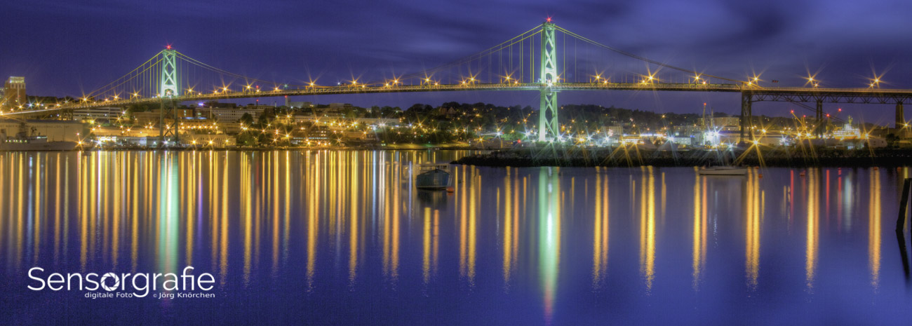
Cinematic color is a visual language. Films often use controlled palettes to support mood, separate subjects from backgrounds, or guide attention through a frame. A night scene may use blue-green shadows and restrained highlights, while a nostalgic interior may rely on warm midtones, soft contrast, and reduced saturation.
There is no single cinematic formula that works for every image. A portrait, landscape, street photograph, and product scene each respond differently to the same adjustment. A strong grade supports the subject and lighting already present. If an image contains warm sunlight, pushing the highlights slightly toward yellow or orange may feel convincing. Applying the same treatment to a cloudy blue scene can look forced.
Think in terms of color relationships rather than isolated sliders. The goal may be separation between the subject and background, a consistent mood across a photo series, or a visual connection between scenes shot under different lighting conditions. This intention should guide every adjustment that follows.
Prepare A Neutral Lightroom Base
Begin in the Basic panel with a balanced exposure. Correct obvious white balance problems, recover important highlights, open blocked shadows when necessary, and set a useful contrast level. Color grading becomes harder to judge when the image is severely underexposed or when a strong color cast is still affecting the entire frame.
A neutral base does not mean making the photograph flat. It means ensuring that the tonal and color information is under control before stylizing it. Check the histogram, use the clipping warnings, and inspect skin tones if people are present. A cinematic look can include unusual colors, but those colors should appear intentional rather than caused by a miscalibrated white balance.
Next, consider the overall saturation and vibrance. Vibrance usually protects skin tones and already-saturated colors more gently, while saturation affects the entire image with equal force. Reducing saturation slightly before grading can create room for selective color decisions. In many cases, an understated palette looks more cinematic than a highly colorful one.
Camera profiles also influence the starting point. Adobe Color produces a vivid, flexible base, while profiles such as Adobe Neutral or camera-matching options may leave more room for a restrained treatment. Choose the profile according to the image rather than habit, then make a virtual copy before experimenting with a more radical style.
Shape The Tonal Color Relationships
Open the Color Grading panel and you will find separate controls for Shadows, Midtones, and Highlights, along with a Global wheel. Each area includes hue, saturation, and luminance controls. The wheel determines the color direction, saturation controls intensity, and luminance changes brightness within that tonal range.
Start with the shadows because they often establish the atmosphere. A small shift toward cyan, blue, or green can make an image feel cooler and more spacious. A subtle red, orange, or amber shift can create warmth and density. Keep saturation low at first. It is easier to increase a restrained effect than to repair shadows that have become artificially colorful.
Midtones usually have the greatest influence on people and important objects. For portraits, warm midtones can flatter skin, but excessive orange quickly becomes distracting. A gentle amber or rose tint may be enough. For urban or architectural work, cooler midtones can emphasize steel, concrete, and glass without turning the entire image blue.
Highlights control the impression of light. Warm highlights often resemble sunlight, practical lamps, or projected film light. Cooler highlights can suggest moonlight or a clean modern palette. The relationship between highlight and shadow colors matters more than either color alone. A warm highlight paired with a cool shadow creates separation, while similar hues across all tonal ranges produce a more unified and subdued grade.
The following starting points are useful as references, not fixed recipes:
| Visual Direction |
Shadow Hue |
Midtone Approach |
Highlight Hue |
Saturation Guidance |
| Warm daylight film |
Cool blue-green |
Slightly warm |
Amber or golden |
Low to moderate |
| Moody nighttime scene |
Blue or cyan |
Neutral to cool |
Muted blue |
Low |
| Vintage portrait |
Soft teal or violet |
Warm rose or amber |
Creamy yellow |
Low |
| Desert or travel image |
Deep blue |
Warm orange |
Golden yellow |
Moderate |
| Clean editorial style |
Neutral blue |
Nearly neutral |
Soft warm tint |
Very low |
Use the Blending slider to decide how much the tonal ranges overlap. Lower blending keeps the shadow, midtone, and highlight colors more distinct. Higher blending creates a smoother transition and often looks more natural on portraits or landscapes. Balance determines whether the grade favors the shadows or highlights. If the shadows are carrying the mood, move Balance slightly toward them; if the image is built around warm light, favor the highlights.
Add Contrast And Refine The Palette
Color grading cannot replace tonal structure. Once the color wheels are set, return to the Tone Curve and refine the contrast. A gentle S-curve can deepen blacks and lift highlights, giving the image more shape. For a softer film appearance, raise the black point slightly and reduce extreme contrast.
Pay attention to the interaction between contrast and saturation. Increasing contrast can make colors appear stronger even when the saturation sliders have not changed. Lowering highlights may reveal colors that were previously clipped, while opening shadows can reduce the perceived intensity of a cool shadow grade. Revisit the Color Grading panel after major curve adjustments.
The HSL/Color panel is useful for selective corrections that the three-way wheels cannot provide. You might reduce the saturation of bright green foliage, shift a distracting yellow wall toward orange, or make blue clothing slightly deeper. Use these controls sparingly. A cinematic grade usually benefits from a limited palette, but removing every secondary color can make the scene feel artificial.
Color Calibration can provide another layer of control, especially when the raw file has a particular camera rendering. Adjust the primary hues and saturation carefully, then compare the result with the original profile. These controls affect broad color families, so small movements can produce large changes in skin, foliage, and skies.
Guide Attention With Local Adjustments
Global grading applies the same treatment throughout the frame, but cinematic images often rely on localized color and light. Lightroom masks allow you to isolate a subject, sky, background, or manually painted area. Within a mask, you can adjust temperature, tint, saturation, exposure, and contrast to create visual hierarchy.
For example, a subject can receive slightly warmer midtones while the background becomes cooler and less saturated. This difference helps the subject stand out without requiring an exaggerated vignette. A sky mask can be cooled and darkened gently, while a foreground mask can retain warmer earth tones to create depth.
Use masks with restraint and inspect the edges at high magnification. Color halos around hair, buildings, or foliage can reveal an adjustment immediately. Feathering and range selections help produce transitions that feel photographic. If a mask is doing too much, reduce its saturation or exposure effect before deleting it entirely.
The shooting stage also influences how well a cinematic grade works. Consistent focus, controlled exposure, and accurate subject placement leave more usable information for editing. Photographers who want to improve capture technique can consult this focus peaking guide when working with manual focus, especially for scenes where precise detail supports the final mood.
Build A Repeatable Editing Workflow
A cinematic look becomes more practical when it can be repeated across a series. After creating a grade, save the color treatment as a preset, but exclude settings that should vary from image to image, such as exposure, crop, masking, and white balance. A preset containing only the creative adjustments gives you a consistent starting point without forcing every photograph into the same tonal structure.
Apply the preset to several images from the same shoot and then synchronize selectively. Check skin tones, bright objects, green vegetation, and deep shadows. The same color values can behave differently depending on the original lighting and camera exposure. Consistency comes from making related decisions, not from refusing to adjust individual frames.
A useful workflow is to edit one representative image first, then test the look on a brighter frame, a darker frame, and a scene with different colors. If the grade fails on those examples, refine the preset before applying it widely. This prevents a polished look from becoming inconsistent across a gallery, portfolio, or video-inspired photo sequence.
Recommendations For A More Convincing Grade
- Begin with modest saturation and increase it only when the image still needs stronger color separation.
- Use warm highlights and cool shadows as a starting relationship, not an automatic formula.
- Protect skin tones by checking faces at normal viewing size and close magnification.
- Compare the edited image with the original regularly to prevent gradual overprocessing.
- Save separate presets for portraits, landscapes, interiors, and low-light scenes.
Finish With Care And Export Intentionally
Before exporting, view the image at fit-to-screen size and at 100 percent. At normal size, judge mood, balance, and subject emphasis. At full size, look for color noise in shadows, posterization in skies, clipped highlights, and halos around masked areas. A grade that looks subtle in the Develop module may appear much stronger on a bright monitor or mobile screen.
Soft proofing and display calibration can also affect the result. A saturated cyan shadow may look controlled in Lightroom but become harsh on another display. For web use, export in sRGB and sharpen according to the intended output. For printing, use the appropriate profile when available and expect that paper may soften contrast and reduce apparent saturation.
Cinematic editing works best when it remains subordinate to the photograph’s story. If the viewer notices the color treatment before noticing the subject, reduce the intensity. When the palette, contrast, and local adjustments support the scene without calling attention to themselves, the image gains atmosphere and coherence.
Open a small set of your photographs in Lightroom, choose one emotional direction, and build the grade gradually from a neutral base. Save the versions that feel most natural, compare them side by side, and use the strongest result as the foundation for a personal cinematic preset.