How to Use the Rule of Thirds and When to Break It
Good composition gives a photograph direction before the viewer has consciously decided where to look. Among the most familiar compositional tools, the rule of thirds remains useful because it creates visual balance without making every image feel rigid or symmetrical. It is easy to apply, quick to check in a camera viewfinder, and flexible enough for landscapes, portraits, street scenes, and everyday photography.
Yet a grid is a guide rather than a law. Strong images can place the subject in the center, divide the frame in half, or leave the conventional focal points completely empty. Learning how to use the rule of thirds and when to break it means understanding what the grid does, recognizing when it supports the story, and knowing when another structure will communicate more clearly.
The best results come from treating composition as a set of decisions rather than a collection of rules. Light, subject movement, negative space, visual weight, lens choice, and the viewer’s emotional response all influence where important elements belong. The grid is one useful starting point within that larger process.
Understanding The Grid
Imagine your frame divided by two vertical and two horizontal lines, creating nine equal rectangles. The four intersections are commonly called power points because they naturally attract attention. Placing a face, architectural detail, animal, or other subject at one of these points often produces a balanced image with a sense of movement.
The rule of thirds also helps with broad divisions. A horizon positioned near the upper third gives priority to the foreground, while a horizon near the lower third emphasizes the sky. In a portrait, placing the eyes close to an upper intersection can leave room for the person to look into. In a landscape, a tree or mountain peak can sit near a vertical third rather than directly in the center.
This compositional technique works because viewers tend to scan images in patterns rather than respond equally to every area. Off-center placement creates a relationship between the main subject and the surrounding space. That space may show a destination, suggest isolation, reveal context, or simply make the frame feel less static.
Many cameras and smartphone apps can display a thirds grid in live view. Turn it on while practicing, but avoid becoming dependent on it. The purpose of the overlay is to train your eye until you can recognize balance without needing visible lines.
Applying It In Real Scenes
Start by identifying the visual subject, then decide which part of it deserves emphasis. A person’s eyes may be more important than the entire figure; in a flower photograph, the center of the bloom may matter more than the stem; in a cityscape, a brightly lit doorway may carry the image. Place that key detail near a power point instead of trying to align the whole subject mechanically.
Direction matters as much as position. If a cyclist is moving toward the right side of the frame, placing the cyclist near the left third can create room for motion. If a person is looking to the left, additional space in that direction gives the gaze somewhere to travel. This is often called look room, lead room, or breathing room.
The technique is particularly effective when the background contains meaningful information. A child positioned on one side of a playground, a boat placed near a lower corner with open water ahead, or a climber set against a large mountain can all gain narrative strength from asymmetrical framing. The empty area is not wasted; it supports the subject’s story.
You can apply the rule before pressing the shutter or afterward through cropping. However, composing in camera usually preserves more resolution and gives you a better sense of the final image. A crop can refine the arrangement, but it cannot always recover missing context or create convincing space in the direction of movement.
Balancing Light And Visual Weight
The thirds grid describes position, but composition also depends on visual weight. A small, bright object can attract more attention than a large area of dark tone. Color, contrast, texture, sharpness, and human faces may pull the eye away from the point where you placed the subject. An image can follow the grid and still feel unbalanced.
Suppose a portrait subject sits near the left third while a vivid red sign occupies the opposite corner. The sign may compete with the face, especially if it is brighter or more saturated. You can solve this by changing your position, simplifying the background, adjusting exposure, or using a shallow depth of field. Good composition often begins with reducing distractions.
Leading lines can reinforce a thirds-based arrangement. Roads, fences, shadows, rivers, and architectural edges can guide the viewer toward the focal area. Try to position the end of a line near a power point, while allowing the line to enter from a corner or edge. This creates a visual path through the frame rather than leaving the subject isolated.
Lens choice influences these relationships. A wide-angle lens can make surrounding space prominent, while a telephoto lens compresses distance and gives background shapes greater visual weight. Photographers comparing equipment, such as in this lens comparison review, should consider how focal length, perspective, and rendering affect composition as much as sharpness or autofocus performance.
| Scene or subject |
Useful thirds placement |
What to watch for |
A possible alternative |
| Landscape with a dramatic sky |
Horizon near the lower third |
A featureless foreground may feel heavy |
Center the horizon for a graphic reflection |
| Portrait with a clear gaze |
Eyes near an upper power point |
Distracting background elements |
Center the face for intimacy or symmetry |
| Moving vehicle or athlete |
Subject near the rear third with space ahead |
Too much empty space can weaken impact |
Crop tightly to emphasize speed |
| Architecture |
Strong edge or vertical line near a third |
Leaning lines and uneven perspective |
Use centered symmetry or a frontal view |
| Wildlife in an open environment |
Animal near a side third |
The animal may blend into its surroundings |
Center it when direct eye contact dominates |
| Minimal still life |
Object near a lower or side intersection |
Excess space may appear accidental |
Use central placement for a poster-like design |
Recognizing When Centered Composition Works
Centered composition is often criticized because beginners may place everything in the middle without considering alternatives. The problem is not the center itself; it is unexamined placement. A centered subject can be powerful when the image depends on symmetry, directness, repetition, or a confrontation between the subject and viewer.
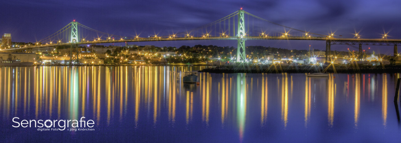
Architectural photography frequently benefits from central framing. A doorway, corridor, staircase, or facade can become more compelling when its geometry is aligned with the center of the frame. Reflections on still water also invite a central horizon because the visual appeal comes from equivalence between the upper and lower halves.
Centered portraits can create intensity. A face looking directly into the camera may feel calm, formal, confrontational, or iconic when it occupies the middle of the frame. This approach reduces the viewer’s ability to wander and makes the relationship between subject and photographer more immediate. It is especially effective with uncluttered backgrounds.
Use the center when the subject has strong visual authority or when the surrounding design is symmetrical. Also consider it for simple graphic images, passport-like documentation, product photography, and photographs where the subject’s directness is more important than a sense of movement. A deliberate central composition is very different from an accidental one.
Breaking The Rule With Intention
Breaking the rule of thirds works when the alternative arrangement has a clear visual reason. You might center a solitary tree to emphasize loneliness, place a horizon halfway through the frame to highlight symmetry, or push the subject toward the edge to create tension. The decision should strengthen the image’s mood, structure, or meaning.
A subject at the extreme edge can suggest departure, uncertainty, or confinement. This is common in documentary and street photography, where a person partly leaving the frame may create a story that feels unfinished. The viewer begins to imagine what happened before the moment and what may happen afterward.
Symmetry is another strong reason to ignore the grid. Repeating windows, mirrored reflections, rows of trees, and formal interiors often lose their impact when shifted toward a third. In these cases, central alignment helps the viewer appreciate pattern and order. Small flaws in symmetry can even add tension, so check the edges carefully and keep the camera level when precision matters.
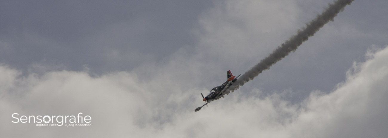
You can also break the rule by leaving the traditional power points empty. A tiny subject surrounded by negative space may communicate vulnerability or scale. A nearly empty frame can be more expressive than a tightly balanced composition when the silence, distance, or isolation is part of the subject.
Using Other Composition Tools
The rule of thirds should work alongside, rather than replace, other compositional methods. Diagonal lines create energy, curves encourage a slower visual journey, and frames within the frame direct attention through windows, arches, foliage, or shadows. Layering gives a scene depth by arranging foreground, middle ground, and background elements.
The golden ratio and golden spiral offer another way to organize visual flow, although they are often applied more loosely than the thirds grid. Triangles can create stability, while a centered vertical axis can create formality. Repetition establishes rhythm, and a deliberate interruption in that repetition gives the eye a focal point.
Negative space deserves special attention. Empty sky, plain walls, dark water, or an untextured background can isolate a subject and amplify its emotional effect. When using negative space, check whether it feels intentional. A clean shape, consistent tone, or clear directional relationship usually makes the emptiness feel designed rather than unfinished.
Cropping and editing can help test different structures. Make a copy of the original file and try a thirds crop, a centered crop, and a panoramic crop. Compare how each version changes the subject’s presence and the balance of visual weight. Guides in editing software can reveal possibilities, but the final decision should be based on the photograph’s message rather than a preset overlay.
Practicing With Purpose
Practice becomes more productive when each exercise has a specific constraint. Photograph the same subject three ways: once using a power point, once centered, and once near the edge. Keep the light and focal length similar so that composition remains the main variable. Reviewing the set later will show which arrangement best supports the subject.
Walk around the scene before settling on a frame. A small shift left or right can move a distracting object away from a third, align a leading line, or create more space in front of a moving subject. Changing height can also transform the balance between foreground and background. Composition is often improved by movement before it is improved by software.
A Focused Shooting Routine
- Turn on the grid and make one photograph that follows it carefully.
- Make a second frame with the subject centered and assess its emotional effect.
- Try an intentionally unconventional placement, such as the extreme edge or a low corner.
- Check the brightest and sharpest areas to see whether they compete with the subject.
- Review the three versions later and write down what each arrangement communicates.
When reviewing your photographs, ask where your eye goes first, where it travels next, and whether that path feels deliberate. Look for dead space, competing highlights, awkward tangencies, and cropped limbs or objects near the frame edge. These observations are more useful than simply labeling an image “correct” or “incorrect.”
It also helps to study successful photographs without reducing them to a single rule. Notice how editorial images use context, how landscape photographs balance sky and land, and how street photographers use off-center framing to preserve spontaneity. The Sensorgraphy photography site offers a broader photography-focused setting in which equipment, digital imaging, editing, and visual practice can be considered together.
Making The Final Decision
Before taking the photograph, identify what the viewer should notice first and what should support that subject. If the thirds grid creates space for a gaze, movement, or important environment, use it. If centering creates symmetry or a stronger relationship with the viewer, center the frame. If pushing the subject aside creates tension or scale, let the composition become uneven.
Technical perfection cannot rescue a weak visual decision, but technical awareness can protect a strong one. Check focus, exposure, shutter speed, and background detail after choosing the composition. A carefully placed subject loses impact if it is blurred unintentionally or hidden by a bright distraction.
There is no requirement to preserve the original framing if a crop improves the image. At the same time, avoid cropping automatically toward thirds simply because the guides make it easy. A photograph should retain the amount of space needed for its story, whether that means a generous margin, a tight edge, or an almost perfectly symmetrical frame.
Use the rule of thirds as a reliable first question: where would this subject feel balanced without becoming static? Then ask the more important second question: what arrangement expresses this moment most honestly? That shift turns composition from a formula into a visual language.
Practice the grid, test its alternatives, and review the results with attention to mood, movement, and meaning. The more deliberately you compare these choices, the faster you will recognize when a conventional placement strengthens a photograph and when breaking the pattern gives it greater force. Apply these exercises in your next shooting session and let the scene, rather than the rule, determine the final frame.