How to Use Lightroom’s HSL Panel for Precise Colour Control
Colour is one of the strongest ways to shape a photograph. A small shift in the blue of a sky, the green of foliage or the orange tones in skin can change the mood, depth and perceived quality of an image. Lightroom’s HSL controls provide a more selective alternative to global saturation or temperature adjustments, allowing you to refine individual colour families without disturbing the whole frame.
HSL stands for Hue, Saturation and Luminance. In newer Lightroom versions, these controls appear in the Color Mixer, with HSL available as a mode alongside Color. The principles remain the same: Hue changes the character of a colour, Saturation controls its intensity and Luminance changes how light or dark it appears. For photographers working with landscapes, portraits, street scenes or night images, this panel is one of the most precise editing tools available.
Understanding The Three HSL Controls
Hue determines where a colour sits within the spectrum. Moving the blue Hue slider towards cyan can produce a warmer turquoise sky, while moving it towards purple creates a deeper, more violet-blue result. The same principle applies to every colour channel, including red, orange, yellow, green, aqua, blue and purple.
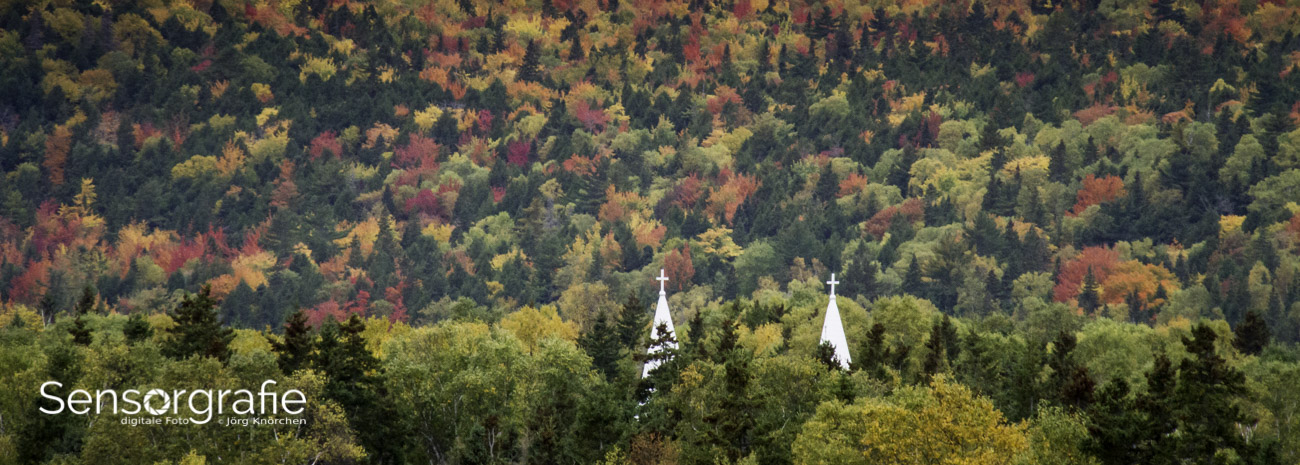
Saturation controls the strength of a colour. Raising saturation can make autumn leaves richer or a subject’s clothing more prominent, but excessive adjustments quickly produce artificial edges and poster-like tones. Luminance controls brightness within a colour range. Lowering blue luminance can add drama to a sky, while lifting orange luminance can brighten skin or warm architectural surfaces.
These sliders affect colour ranges rather than individual objects. A blue Hue adjustment may influence the sky, water, clothing and shadows at the same time. This is why HSL editing works best when you first identify every area represented by a colour, then make small changes while viewing the entire image at a useful zoom level.
Start With A Controlled Editing Workflow
Begin with a properly prepared raw file. Correct exposure, lens corrections and white balance before making detailed colour decisions. If the overall image is too warm or too cool, HSL adjustments may become a workaround for a problem that should have been fixed with the Temperature and Tint controls. A useful reference on this subject is understanding white balance, particularly when artificial light and mixed daylight create confusing colour casts.
Open the Color Mixer and choose HSL rather than adjusting every colour indiscriminately. Work through the image with a clear purpose: perhaps you want a cleaner blue sky, less distracting yellow grass or more natural skin. Make one category of change at a time, then toggle the panel off and on to check whether the improvement is visible at normal viewing size.
Before moving a slider, consider the visual role of the colour. A strong green may be an important part of a rainforest scene, but it may be an unwanted distraction in a portrait. Editing is more consistent when you are solving a compositional problem rather than simply chasing the most vivid version of each colour.
Use The Targeted Adjustment Tool
The targeted adjustment tool is often faster and more accurate than guessing which slider controls a particular area. Click the small circle icon in the Color Mixer, move over the colour you want to change and drag vertically. Dragging upwards generally increases the selected property, while dragging downwards decreases it, depending on whether Hue, Saturation or Luminance is active.
Lightroom may adjust two or more colour channels because a single area often contains blended hues. A green leaf, for example, may include yellow-green and blue-green values. The targeted tool identifies those component colours and moves the relevant sliders together, giving you a more direct way to refine the subject.
Watch for unintended changes in nearby areas. A targeted adjustment on a red jacket could also affect red flowers, brick walls or skin tones elsewhere in the frame. If the colour range is too broad, return to the individual sliders and reduce the adjustment. For even more control, use a mask or brush after the global HSL work to isolate the effect.
Refine Hue Without Breaking Colour Harmony
Hue adjustments are particularly useful for creating a coherent colour palette. In a landscape, shifting yellow slightly towards orange can make dry grass and late-afternoon light feel warmer. Moving green towards yellow may suit a sunlit summer scene, while shifting it towards aqua can create a cooler, more cinematic appearance.
Use small movements first. Large Hue changes can create abrupt transitions where one colour meets another, especially around foliage, buildings and fine hair. The effect may look acceptable at fit-to-screen size but become obvious when the image is printed or viewed on a large monitor.
Colour relationships matter more than individual sliders. If you shift the Hue of a blue sky but leave reflected blue light on water or buildings unchanged, the scene may lose consistency. In Australian coastal cities such as Sydney, bright skies, pale sandstone and reflected light can all share related blue and yellow tones. A restrained adjustment usually preserves the natural connection between these elements better than a dramatic colour shift.
Control Saturation With Restraint
Saturation is the slider most likely to be overused. Increasing one colour can help direct attention, but it can also exaggerate noise, compression artefacts and uneven lighting. Strong saturation in orange and red channels is especially risky in portraits because it can make skin appear flushed or sunburnt.
Try reducing competing colours instead of boosting the subject. Desaturating yellow-green foliage can make a person in a red jacket stand out without making the jacket unnaturally intense. This subtractive approach often produces a more polished image and preserves colour separation.
Australia’s intense sunlight can produce highly saturated scenes, particularly around beaches, national parks and outdoor markets. Images made at midday may already contain strong cyan skies, yellow highlights and deep green shadows. Lowering selected saturation values can recover a more believable tonal balance, while preserving enough colour to communicate the heat and brightness of the location.
Use Luminance To Shape Attention
Luminance adjustments change the perceived brightness of a colour without directly changing its hue. Lowering blue luminance can give a pale sky more depth, while raising orange luminance can bring attention to a warmly lit building or a person’s face. Because luminance changes contrast within colour ranges, it can be more subtle than a global exposure adjustment.
Use luminance carefully around edges. Darkening green foliage may separate a subject from the background, but it can also make shadow areas look blocked. Raising luminance in a colour that contains image noise may make that noise more visible. Zoom out regularly and check whether the adjustment improves the entire composition rather than one small area.
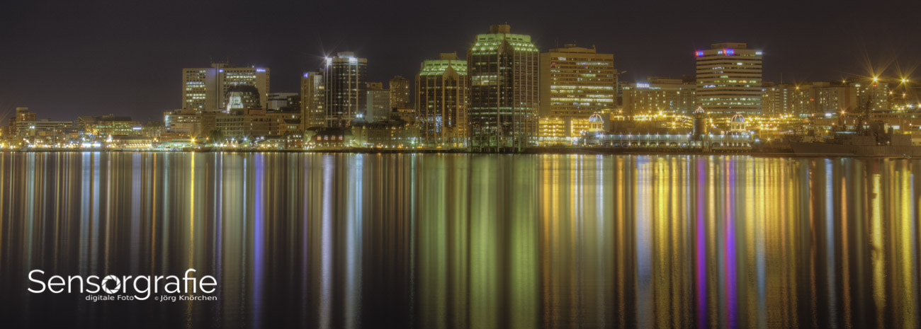
For night photography, luminance can help distinguish a dark blue sky from black shadows, but it cannot recover detail that was never captured. Before editing stars or the Milky Way, check focus, exposure and noise reduction. The guidance in this star photography guide is useful for understanding how capture choices affect later colour work.
Combine HSL With Masks And Other Tools
HSL is most effective when used alongside Lightroom’s masking tools. A global blue adjustment might improve a sky but also alter blue clothing in the foreground. Select Sky or use a colour range mask to limit the edit, then refine the mask with the Brush or Subtract options. This separates broad colour correction from local visual emphasis.
The Color Grading panel can add a controlled tint to shadows, midtones or highlights after HSL work is complete. Curves can adjust contrast, while the Basic panel handles overall exposure and white balance. Avoid asking HSL to perform every task; a natural result usually comes from several modest adjustments rather than one extreme slider movement.
If the final image will be displayed online, remember that colour management matters. Export in sRGB for most websites and social platforms, and check the result on more than one screen. Australian photographers selling prints or commercial images should also inspect a proof, because a vivid monitor display may hide changes introduced by the printing process.
Build A Repeatable Colour Review
A consistent review process helps prevent editing by impulse. Save a virtual copy before experimenting, especially when working on an important client image or a photograph intended for a gallery. Compare the original and edited versions without relying only on the last change you made.
The local market also rewards practical, dependable colour work. Australian photographers may deliver images for tourism businesses in Cairns, property clients in Melbourne or family portraits in Perth, each with different expectations for colour. A recognisable personal style is useful, but accurate skin, believable skies and clean product colours remain essential when an image represents a client’s business.
Keep Australian legal and commercial realities in mind when sharing photographs. Copyright generally remains with the creator unless rights are assigned or licensed, and the Australian Consumer Law applies when photographic services or products are sold to consumers. Colour editing does not replace clear agreements about usage, delivery specifications and revisions. For public-facing work, also consider privacy, private-property permissions and any restrictions attached to commercial locations.
A Practical HSL Review Checklist
- Correct exposure, white balance and lens issues before detailed colour editing.
- Identify the visual purpose of each colour before moving Hue, Saturation or Luminance.
- Use the targeted adjustment tool to locate blended colour ranges quickly.
- Prefer small, selective changes over maximum saturation or dramatic Hue shifts.
- Check skin, skies, foliage and reflective surfaces for unintended edits.
- Review the final image at fit-to-screen size, close zoom and the intended export format.
For photographers wanting a broader reference point on digital imaging and editing, Sensorgraphy’s photography resources provide a useful context for developing a complete workflow. The HSL panel becomes far easier to control when it is treated as one part of that workflow: capture carefully, correct globally, refine selectively and review the image as a complete visual statement.