Negative Space in Minimalist Photography
Minimalist photography is often described by what it leaves out, but an empty-looking frame can still be visually active. Negative space is the area around a subject that contains little detail: plain sky, a smooth wall, an unoccupied floor or a broad band of shadow. Its boundaries guide attention, define scale and establish the relationship between a subject and its surroundings.
The aim is not to remove information indiscriminately. It is to make every remaining relationship clearer. A photographer can use empty space to suggest calm, distance, anticipation or tension, then reinforce that feeling through viewpoint, light, colour and editing. This approach suits Australian settings, from busy urban streets to expansive inland scenery, provided the frame is organised with care.
Why empty space works
Negative space gives the eye somewhere to rest. When a subject sits against a detailed background, the viewer’s attention divides between shapes, colours and textures. A simpler area creates a clear entry point, allowing the main subject to gain visual weight without becoming larger or more dramatic.
Space also establishes balance. A small subject placed near the edge can feel stable when a generous area extends in the direction it faces. Centred subjects can feel secure and formal, while unequal space may suggest vulnerability, movement or isolation. The decision should follow the intended mood rather than a fixed compositional formula.
Emptiness does not have to mean a lack of story. An open doorway, a single chair or a figure separated from a crowd can say more than a crowded scene filled with unrelated actions. The useful question is whether the open area clarifies the subject or simply exposes unused frame.
Planning the frame before lifting the camera
Begin by walking through the location without making a photograph. Look for walls, doorways, railings, open pavement, clear horizons and patches of even sky. A change of position often creates negative space more effectively than waiting for a person or object to move. Before pressing the shutter, check the frame edges as carefully as the centre.
Lens choice alters the amount and shape of space surrounding a subject. A wide lens can place a small figure within an expansive environment, while a standard lens often produces a more balanced relationship between subject and setting. Longer lenses compress layers and can separate a subject from otherwise distracting surroundings. Rotating the camera changes orientation, but crops made in editing should follow the same control.
Depth of field should support the intended hierarchy. A shallow depth of field softens background detail, although a completely blurred background is not essential. Keeping some recognisable texture can give the empty area character while still directing attention toward the subject. Aperture, shutter speed, ISO and camera stability should be balanced for the light and the amount of detail that needs to remain visible.
Light, tone and texture
Light determines how negative space feels. A evenly lit white wall may appear flat, while the same wall can gain depth through a gentle gradient. Side light can reveal texture, shaped shadows or the edge of a surface. In many inland and northern parts of Australia, strong midday sun produces hard edges and deep contrast, so finding shade or waiting for lower light can be decisive.
Expose for the brightest important area when a wall, sky or pale surface might otherwise lose detail. The histogram and highlight warnings help reveal clipped tones, while brackets or a single well-placed exposure may preserve both bright surfaces and darker subject features. Processing should retain enough tonal separation for the open area to remain intentional rather than blank.
Texture can occupy negative space without competing for attention. Sydney sandstone façades, smooth rendered walls, calm coastal water and dark water surrounding a pier may all carry visible detail. The treatment depends on the subject: fine texture can suggest place, while broad areas of tone often create a quieter graphic effect. Monochrome conversion can also separate shape from colour clutter, provided tonal contrast remains convincing.
Placing the subject with purpose
Think of negative space as an active partner rather than leftover background. Its size, direction and brightness influence the subject’s apparent importance. A narrow strip can intensify confinement; a broad horizontal field can create calm; a large vertical opening can emphasise height. These effects come from the relationship between areas, not from one placement working better than every other placement.
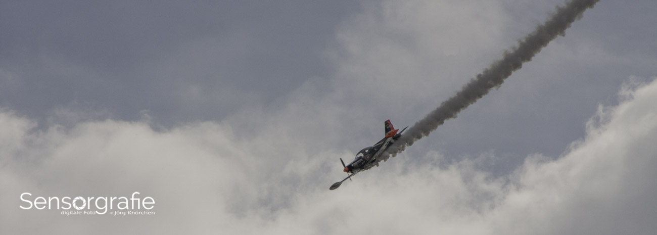
Direction matters with people and moving subjects. Leave room in front of a walking figure, a cyclist or a vehicle if the frame should imply continuation. Less space in front can stop movement or create urgency. An Australian photographer might scout during the arvo, when angled sunlight reveals more shape in a wall or pavement, then wait for the subject to cross the open section.
Colour should also establish hierarchy. A restrained palette allows one small accent to carry attention, but an isolated bright object can become too dominant if surrounded by several competing colours. Repeated shapes may link subject and space, while a strong contrast at one edge can pull the eye away from the intended centre. Simple compositions still require active decisions about what attracts attention first.
Street scenes and open landscapes
Melbourne laneways offer a useful urban test because graffiti, signs, bins, bicycles and passing pedestrians can quickly overwhelm a frame. Instead of removing everything, isolate a plain section of brick, a clean geometric shadow or a doorway aligned with a distant subject. A small amount of visual friction can add character without disturbing the main structure.
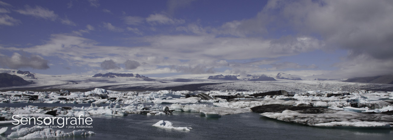
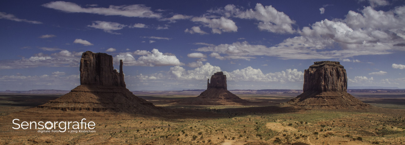
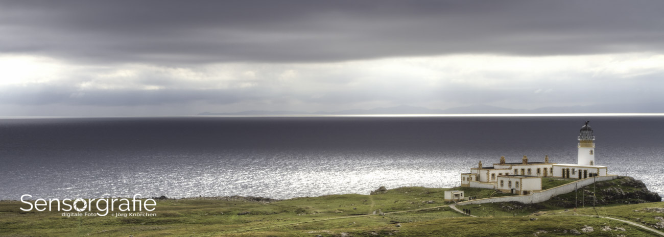
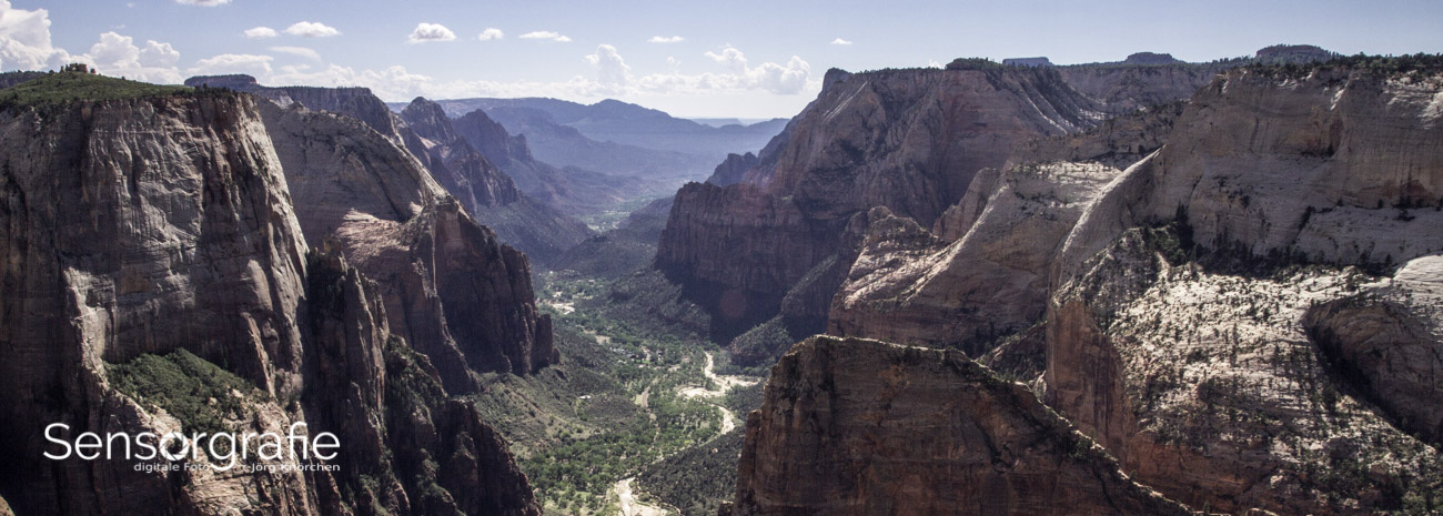
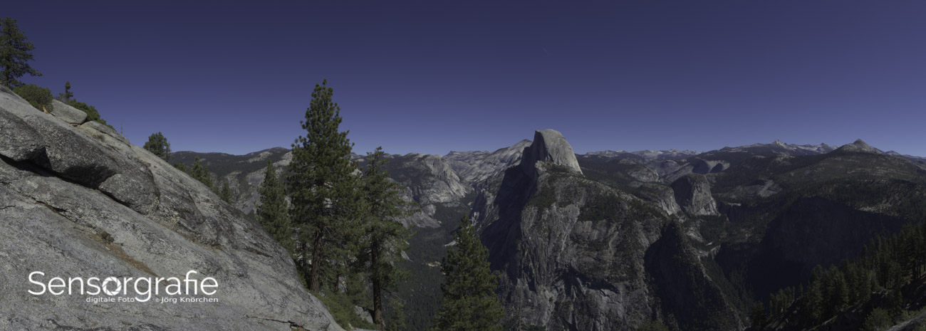
Open Australian landscapes demand careful control of scale. In the Red Centre, the centre or across the open coast of Tasmania, a person or familiar object can reveal enormous distances. Foreground texture provides an entry point, a middle-ground subject anchors the story and sky or distant land creates the negative area that carries scale. Wide panoramas need particularly disciplined horizons and transitions between tonal zones.
Cultural setting also affects how minimalist images are created and presented. Photography on Aboriginal Country or near significant sites may require permission, cultural knowledge and awareness of appropriate behaviour. Sacred imagery, restricted areas and community protocols should not be reduced to graphic shapes for visual effect. Captions can provide context, while responsible practice may mean leaving a subject or location alone.
Portraits and products in spare settings
For portraits, negative space can express environment without showing the whole room. Position the subject beside a plain wall, doorway or window and control the edges so hands, limbs and furniture do not create accidental tangencies. Body angle, expression and the amount of space around the figure determine whether the portrait feels open, protected, formal or emotionally distant.
A product can be made legible through controlled separation rather than an entirely featureless background. A sweep, painted board, stone surface or plain wall may provide a useful base. Shadows should describe the object’s form, while reflections can add detail if they remain consistent with the light. For a compact workflow, this product photography guide explains how placement and lighting can turn a simple setup into a deliberate image.
Equipment choices add another Australian consideration. Camera and lens prices are commonly listed in Australian dollars and include 10% GST. Imported or grey-market equipment may appear cheaper, although local warranty servicing can be less convenient; Australian Consumer Law protections may still apply. The practical saving should therefore be compared with support, returns and the availability of compatible lenses before making a purchase.
Editing and refining the result
Begin with the raw file when available, applying lens corrections and a restrained crop before removing distractions. Cropping can strengthen a relationship between subject and negative space, but repeated trimming may leave the composition feeling compressed. Keep a little breathing room unless tension is clearly intended, and inspect the image at actual size as well as enlarged.
Use masks and local adjustments to refine brightness, colour and texture. Lifting a subject slightly can integrate it with its surroundings, while reducing a bright patch can prevent the eye from leaving the main subject. Remove small distractions only when they compete with the intended hierarchy. Every repaired area changes the balance, so cloning should preserve natural texture rather than create artificial smoothness.
A consistent edit helps related photographs share the same visual language. Fixed crops, restrained contrast and a limited tonal range can form a coherent series without making every frame identical. The broader photography practice notes offer useful context for equipment, software and workshop decisions. When the subject, open area and tonal structure agree, negative space becomes the quiet structure that holds the photograph together.