Understanding histograms for accurate exposure
A camera histogram is one of the most useful tools for judging exposure in digital photography. It translates the brightness values in an image into a simple graph, allowing you to see whether tones are concentrated in the shadows, spread across the middle, or pushed toward the highlights. Once you understand what that shape means, you can make better exposure decisions in bright sunlight, low light, and high-contrast scenes.
The display may look technical at first, but it is easier to interpret than many photographers expect. The left side represents dark tones, the right side represents bright tones, and the height of the graph shows how many pixels occupy each brightness range. The histogram does not show where those pixels appear in the frame; it describes their tonal distribution.
A histogram is most valuable when the camera screen is difficult to judge. Glare can make a well-exposed image look too dark, while a shaded display can disguise clipped highlights. Learning to combine the graph with the preview, highlight warnings, and the subject itself gives you a dependable exposure workflow.
What a histogram shows
The horizontal axis runs from black on the far left to white on the far right. Shadows and deep blacks appear toward the left, midtones occupy the center, and highlights appear toward the right. The vertical axis indicates the number of pixels at each brightness level. A tall peak therefore means that many pixels share a similar tone, while a low area contains relatively few pixels.
This graph is a tonal map rather than a miniature version of the photograph. A peak on the left does not mean the left side of the composition is dark. It means that a large portion of the image contains dark values. A bright object in the center of the frame may create a peak at the far right, even though its physical position has nothing to do with the graph’s position.
There is no universal histogram shape that represents a correctly exposed image. A photograph of a black cat against a dark background should naturally lean left. A snowy landscape may be weighted heavily toward the right. The goal is to preserve the important detail for the subject, rather than force every scene into a broad, centered distribution.
Reading tonal distribution
A graph pressed against the left edge can indicate underexposure, especially when the scene should contain visible shadow detail. If the edge rises sharply and stays high, dark tones may be clipped to pure black. Once a file contains clipped black pixels, brightening it in post-processing cannot restore texture that was never recorded.
A graph pressed against the right edge can indicate overexposure. This is particularly serious when the affected pixels belong to skin, clouds, white clothing, or reflective surfaces. Highlight clipping turns texture into featureless white. RAW files provide some recovery latitude, but recovered highlights are not guaranteed to contain meaningful detail.
A broad histogram that reaches from shadows to highlights often suggests a scene with strong contrast. That may be exactly what the photograph requires. A narrow graph can be perfectly appropriate for fog, soft window light, or a low-contrast portrait. The shape should be interpreted in relation to the subject, lighting, and intended mood.
Many cameras provide separate red, green, and blue channel histograms. The combined brightness graph can appear safe while one color channel clips. A saturated red flower, blue neon sign, or sunset cloud can lose detail in a single channel before the overall luminance display reaches the edge. When color accuracy matters, inspect the individual channels as well.
Highlight warnings and camera previews
The blinking highlight warning, often called the blinkies display, is a quick way to locate areas that may be overexposed. It is more visually direct than a histogram because it marks the affected regions on the image preview. However, the warning threshold depends on the camera’s JPEG rendering and settings, so it should be treated as an alert rather than an absolute measurement.
The rear LCD preview also reflects picture style, contrast, saturation, and white balance choices. A high-contrast picture style can make the preview and histogram look more extreme than the underlying RAW data. Conversely, a flat-looking preview may conceal a file that still contains a large amount of tonal information.
Photographers working with RAW files often expose toward the right, a technique known as exposing to the right or ETTR. Recording more data in the brighter tonal ranges can reduce shadow noise when the image is later darkened. This approach requires care: the brightest important detail must remain below clipping, and the desired final brightness should guide the decision.
The best exposure is frequently a compromise. Protecting a bright sky may leave a foreground too dark, while brightening the foreground may sacrifice cloud detail. In such cases, consider changing the light, using a graduated neutral-density filter, capturing a bracketed sequence, or planning to combine exposures. The histogram reveals the limitation, but it cannot remove the contrast in the scene.
Histogram patterns in common scenes
The following patterns provide useful starting points, though the subject’s visual importance should always take priority over a particular graph shape.
| Scene or subject |
Likely histogram pattern |
Main exposure risk |
Practical response |
| Snow, pale buildings, or bright sand |
Weighted toward the right |
Gray-looking highlights or clipped white detail |
Add exposure carefully while checking the right edge |
| Black subject on a dark background |
Weighted toward the left |
Loss of shadow texture |
Brighten until important detail is preserved |
| Backlit portrait |
Two strong tonal groups or a wide spread |
A bright background can cause a dark face |
Expose for the face or add fill light |
| High-contrast city scene |
Broad distribution reaching both sides |
Clipped shadows and highlights |
Protect the most important tones or bracket exposures |
| Fog, mist, or overcast landscape |
Narrow central distribution |
Excessive contrast adjustment later |
Retain the gentle range and avoid forcing the graph outward |
| Sunset with a dark foreground |
Peaks in shadows and highlights |
Bright sky or foreground detail may clip |
Decide which area carries the story, or use graduated filtration |
A snowy scene illustrates why a centered histogram can be misleading. Because the subject contains many bright tones, a correct exposure may place most of the graph on the right. If the photographer automatically darkens the frame to center the graph, the snow may become dull gray. Exposure compensation toward the positive side may be appropriate, provided the snow texture remains intact.
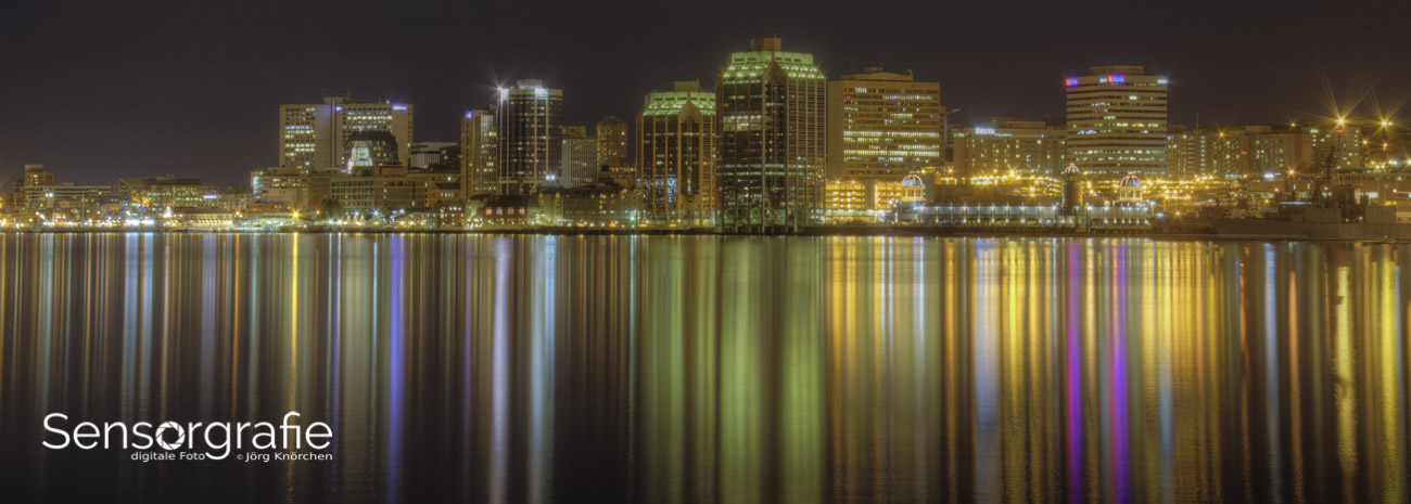
A night street scene creates the opposite challenge. Much of the frame may belong on the left, with small peaks representing streetlights and illuminated signs near the right edge. Those bright points can clip without ruining the photograph if they are visually insignificant. The graph must therefore be judged by the role of each tonal area, rather than by its most extreme point alone.
Using the histogram while shooting
The histogram is easiest to use when it becomes part of a short review routine. After making a test exposure, check the overall brightness, scan for blinkies, and inspect the graph for important detail touching either edge. Then decide whether to adjust shutter speed, aperture, ISO, exposure compensation, or the direction of the light.
In manual exposure, shutter speed and aperture determine the basic brightness while ISO changes the sensor’s amplification. If motion and depth of field are fixed, ISO may be the remaining variable. In aperture-priority or shutter-priority modes, exposure compensation can shift the result without changing the setting that controls the creative effect.
For photographers developing a broader digital workflow, photography resources covering cameras, editing, and image-making techniques can help connect in-camera exposure decisions with later processing. The histogram is most powerful when it is considered as part of the complete image-making process, from capture through export.
Use the RGB histogram when a colorful subject is likely to contain saturated tones. Use the luminance histogram when overall brightness and detail are the primary concerns. Camera implementations vary, so learn how your model displays the graph and whether its histogram is based on a JPEG preview rather than the full RAW data.
From capture to editing
A histogram remains useful in RAW conversion software, where it shows how adjustments alter the tonal structure. Moving the exposure slider changes the overall distribution, while highlights, shadows, whites, and blacks target different areas of the range. Curves provide more precise control by allowing separate adjustments to shadows, midtones, and highlights.
The editing histogram can reveal problems that are easy to miss in a full-screen image. A curve adjustment may create an attractive contrast boost while quietly clipping shadow or highlight detail. Watch the edges as you work, then inspect the image at normal viewing size. Technical preservation is valuable, but a small clipped specular highlight may be harmless if it supports the realism of a polished metal object or a bright lamp.
For web images and prints, the final color space also matters. Converting a wide-gamut file to sRGB can move some colors outside the destination range. Soft proofing and output checks help identify whether a saturated color will compress or lose detail. A histogram cannot predict every color-management issue, but it can show whether the tonal structure has become overly compressed.
Local adjustments deserve special attention. Brightening a face, darkening a sky, or adding clarity to a foreground can create new clipping in a limited area even when the global graph looks acceptable. Masks, graduated filters, and selective curves should therefore be checked at both the local and overall level.
Building a reliable exposure routine
The goal is not to chase a visually impressive graph after every frame. The goal is to make a deliberate decision about which tones deserve protection and which can be allowed to fall outside the recorded range. This mindset prevents the histogram from becoming a rigid rule that weakens creative choices.
A short routine works well in changing conditions:
- Identify the most important highlight and shadow detail before adjusting exposure.
- Check the histogram and RGB channels after a test frame, especially in harsh or colorful light.
- Use blinkies or magnified playback to inspect faces, clouds, white clothing, and reflective surfaces.
- Recheck the graph after changing composition, because a new area of sky or a darker foreground can alter the exposure balance.
- Capture a bracketed sequence when the scene’s dynamic range exceeds what one exposure can comfortably hold.
Practice is most effective when the scene is predictable. Photograph a white object, a black object, and a mixed-contrast subject under the same light. Compare the camera histogram with the RAW file in editing software. This exercise shows how the preview, JPEG settings, and RAW data differ, while making the connection between capture and post-processing more concrete.
Over time, the graph becomes a fast visual language. You will recognize the narrow distribution of mist, the twin peaks of a backlit subject, and the warning signs of lost highlight texture. That knowledge leaves more attention available for composition, timing, and the emotional character of the photograph.
A histogram cannot decide what a photograph should express, but it can show whether the camera recorded the tones needed to express it. Use it alongside the preview, channel warnings, and knowledge of your subject, then adjust exposure with a clear purpose. Review your next series through that lens and let the graph guide better files from the moment of capture.