Understanding the Rule of Thirds and When to Break It
Composition is the quiet structure behind a memorable photograph. Before colour grading, sharpening or choosing a preset, the arrangement of lines, shapes and empty space determines where the viewer looks first and how the image is understood. The rule of thirds is one of the most useful ways to organise that arrangement, particularly when a scene feels visually crowded or lacks a clear point of emphasis.
It is a guide rather than a law. Photographers working with Australian beaches, Sydney architecture, Melbourne laneways or the wide horizons of the outback often find that a central subject, a deliberately tilted frame or a large area of negative space communicates more effectively than a conventional grid placement. The skill lies in recognising why a composition works and making the choice intentionally.
What The Rule Of Thirds Actually Does
Imagine dividing the frame with two horizontal and two vertical lines, creating nine equal rectangles. The four intersections are commonly called power points because elements placed near them tend to attract attention without making the photograph feel rigid. A horizon positioned along the upper or lower horizontal line can also give the sky or foreground a clear role.
This approach works because viewers generally scan a photograph rather than absorbing every detail at once. Placing a person, animal, building or bright highlight near an intersection establishes an immediate visual anchor. The remaining space can then show where the subject is, what it is doing or how it relates to the environment.
The grid is especially helpful when learning to use a camera away from automatic modes. It encourages deliberate decisions about headroom, foreground, background and direction of movement. Most mirrorless cameras, DSLRs and smartphone apps can display a grid in the viewfinder or on the screen, making the principle easy to practise in real time.
Using Balance And Visual Weight
Composition is not simply about positioning the most important object on a grid intersection. Bright colours, strong contrast, sharp detail, unusual shapes and human faces all carry visual weight. A small red umbrella can balance a large grey building, while a dark tree at the edge of the frame can counter a brightly lit subject on the opposite side.
This is why the rule of thirds can produce a stronger result than placing everything in the middle. A surfer on the right third with open water ahead suggests movement and possibility. A portrait subject looking towards the left edge usually benefits from space in that direction, allowing the viewer to imagine the person’s attention extending beyond the frame.
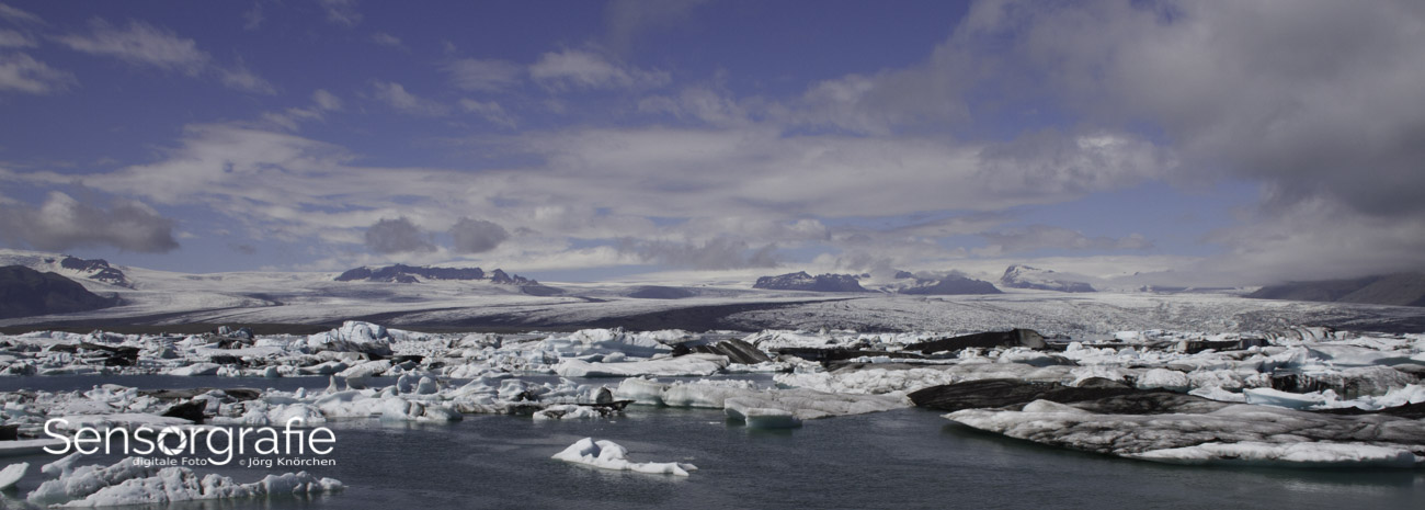
The method also helps with landscape photography. Placing a beach horizon on the lower third gives priority to a dramatic sky, while placing it on the upper third highlights rocks, sand or reflections. In Australia’s intense daylight, this decision can prevent a photograph from becoming an undifferentiated band of bright sky and dark land.
Situations Where The Grid Works Well
The grid is a dependable starting point for travel, street and documentary photography because these genres often involve rapidly changing scenes. At Circular Quay, for example, a photographer might place an approaching ferry near a lower intersection while keeping the Harbour Bridge or skyline in the background. The composition feels ordered without losing the energy of the moment.
It is also effective for environmental portraits. A craft worker at a weekend market in Brisbane can be positioned on one side of the frame, with tools, products or customers filling the surrounding space. This gives context and avoids reducing the person to a head-and-shoulders record. A shallow depth of field can separate the face from distractions, but the arrangement still carries the story.
Wildlife and sports photography benefit from the same logic. A bird flying across a wetland usually needs room in front of its movement, while a runner placed near an intersection can be balanced by the track or landscape ahead. Autofocus, shutter speed and exposure remain important, yet a well-placed subject often makes the difference between a technically clean image and a convincing one.
Photographers should also consider local access and permissions. Commercial work in some parks, reserves or public locations may require approval, and drone operators must follow Civil Aviation Safety Authority rules about areas, distances and operating conditions. A strong composition begins with a safe and lawful shooting position.
Why Centre Composition Can Be More Powerful
A centred subject creates symmetry, stability and visual directness. It can make a portrait feel confrontational, a building feel monumental or a reflection feel perfectly ordered. If the subject has a strong shape and the surrounding elements are quiet, moving it away from the centre may weaken the photograph rather than improve it.
Central framing is particularly suitable for architecture. The entrance of a courthouse, the repeating windows of a modern tower or the tunnel-like perspective of a Melbourne laneway can gain authority when the vanishing point sits in the middle. Symmetry tells the viewer to inspect the structure carefully, so small differences and patterns become part of the image.
Minimalist photographs often need the same treatment. A single shell on pale sand, a lone tree in a vast paddock or a swimmer surrounded by calm ocean can appear more isolated when positioned centrally. In these cases, the empty area is the main subject. The placement communicates stillness and deliberate simplicity.
Breaking the grid also makes sense when the scene itself is symmetrical, circular or strongly geometric. If every major line leads towards the centre, applying a third-based placement can introduce tension that the subject does not require. The correct composition is the one that supports the visual idea.
Alternatives To A Fixed Grid
Leading lines provide one of the most useful alternatives. Roads, fences, railings, shadows and rivers can direct the eye towards a subject or a distant point. A path beginning in the lower corner and curving towards a hiker creates depth, while the subject can remain close to the centre if the lines already provide enough movement.
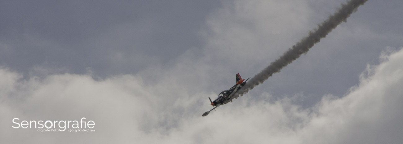
Diagonal composition introduces energy. A cyclist leaning through a bend, a wave breaking across the frame or a staircase cutting from one corner to another can feel more dynamic when the photographer allows the lines to dominate. Tilting the camera slightly may strengthen that impression, although an accidental tilt in an architectural photograph usually looks careless.
Framing is another powerful strategy. Doorways, branches, arches and windows can surround a subject and establish layers within a flat image. Reflections can create a second frame, as happens with wet pavement after a storm in Adelaide or glass façades in Perth. The visual border becomes part of the narrative instead of a distraction.
Negative space can replace the grid as the main organising principle. A small figure against a large sky or wall creates scale, solitude or vulnerability. The subject does not need to sit at a power point when the surrounding emptiness already directs attention towards it.
Applying Composition During Editing
Cropping should refine a decision rather than rescue an unfocused one. A raw file may contain extra space because the photographer needed to react quickly, and a modest crop can move the subject towards a third or remove distracting edges. However, aggressive cropping reduces resolution and can change the relationship between the subject and its environment.
Most editing software includes overlays for the rule of thirds, golden ratio, diagonals and central crosshairs. Switching between these guides is useful because a crop that appears balanced under one overlay may look awkward under another. Photography resources can also help photographers compare camera techniques, editing methods and visual approaches before committing to a workflow.
Straightening and perspective correction deserve attention as well. A horizon that slopes by a few degrees can undermine an otherwise careful composition, particularly in seascapes. Correcting converging verticals can improve buildings, but excessive correction may remove important edge details, so the crop should be checked at several stages.
Aspect ratio changes the strength of a composition. A 3:2 frame may suit a landscape, a square crop can reinforce symmetry, and a tall 4:5 or 9:16 format may better suit a portrait or social-media presentation. A photographer should decide where the image will be viewed before sacrificing meaningful space.
| Approach |
Best suited to |
Visual effect |
Common risk |
| Rule of thirds |
Landscapes, portraits and documentary scenes |
Balanced, natural movement |
Can become predictable |
| Centre framing |
Symmetry, minimalism and architecture |
Stable, direct and formal |
May feel static without strong structure |
| Leading lines |
Roads, rivers, paths and interiors |
Guides the eye through depth |
Lines can compete with the subject |
| Diagonal composition |
Sport, waves and dynamic action |
Adds energy and tension |
Can look accidental if poorly controlled |
| Negative space |
Solitude, scale and quiet subjects |
Emphasises atmosphere and simplicity |
Subject may become too small |
Building A Personal Composition Habit
A practical exercise is to photograph the same subject three ways: first with the subject near a third intersection, then in the centre, and finally with generous negative space. Review the images later without checking the settings. Look for the frame that communicates the subject’s purpose most clearly, rather than choosing the one that follows a rule most precisely.
Try repeating the exercise in different Australian conditions. Strong midday sunlight at Bondi can create hard shadows and high contrast, while overcast light in Hobart may produce softer transitions. A composition that works in one environment may need more breathing room, a lower viewpoint or a stronger foreground in another. Local light should influence placement just as much as the grid.
Keep an eye on the edges of the frame. A bright sign, cut-off limb, stray branch or partial person can pull attention away from the intended subject. Moving one step sideways or changing focal length often solves the problem more effectively than relying on editing. Small physical adjustments can reveal a cleaner relationship between foreground, middle distance and background.
Respect for people and property is part of responsible composition. In Australia, photographers should consider consent when making identifiable commercial portraits, observe location restrictions and understand that copyright generally belongs to the creator of an original photograph under the Copyright Act 1968. A visually successful image still needs an appropriate context for publication or sale.
Practical Choices For Your Next Shoot
- Activate the grid in the camera or phone and use it as a starting reference, not an automatic instruction.
- Identify the subject’s direction of movement or gaze before deciding which side of the frame should contain open space.
- Check brightness, colour and contrast around the edges because visual weight can outweigh geometric placement.
- Make one centred frame whenever the scene has symmetry, repetition or a strong central vanishing point.
- Capture a wider version before cropping so that negative space and alternative aspect ratios remain available.
- Review several compositions on a larger screen and choose the image with the clearest visual intention.
Composition improves when rules become familiar enough to be questioned. The rule of thirds is valuable because it explains balance, spacing and eye movement in a simple way, but its real purpose is to help photographers see relationships within the frame. Once those relationships are understood, breaking the grid becomes a considered creative decision rather than a random departure.