Create moody photographs with colour gradients
A guide to using color gradients in your photography for moody effects begins with a transition between two colours, tones or zones of brightness. That transition can exist in the scene, come from a filter, or be built during editing. The best results rarely depend on a heavy preset; they come from a deliberate relationship between light, subject and palette.
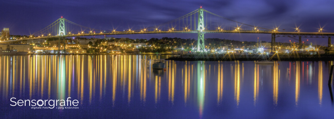
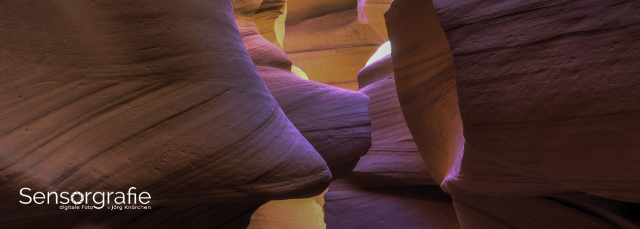
Colour gradients shape mood because they guide the eye and simplify a scene. A dark foreground fading into a pale sky can suggest distance, isolation or scale. Warm amber beside deep blue can create tension, while muted green and brown may feel quiet and cinematic. Direction matters: light behind a subject often feels optimistic, whereas shadow across the face tends to feel reflective or uneasy.
Treat the gradient as part of exposure and composition, not as decoration applied at the end. Decide where the tonal falloff should begin, what must remain readable, and which colour should carry the emotional weight. Then protect those priorities in the RAW file. A restrained gradient can unify an image; an overdone one flattens skin tones, creates halos and makes the scene look artificial.
This approach is particularly useful in Australia, where sunlight can be fierce and brief periods of softness can disappear quickly. Sydney haze, Melbourne's changeable weather and the red earth around Alice Springs offer very different starting points. Working methodically helps you exploit those conditions without chasing an unrealistic version of the landscape.
Plan the colour story before you shoot
Begin by naming two or three dominant colours in the finished frame. One can occupy most of the image, another can provide separation, and a small accent can direct attention. For example, a blue-grey harbour could hold the frame while a rust-coloured roof supplies warmth. Limiting the palette makes subtle transitions easier to see and keeps a moody result from becoming merely grey.
Look for a natural gradient that reinforces the subject rather than competing with it. Vertical walls, tree lines, water and cloud often provide useful boundaries, while side light reveals texture and shape. Bracket a few exposures when the contrast is high, then review them at thumbnail size. The Sensorgraphy photography resources are also useful for checking how different cameras and software handle difficult tonal ranges.
Control light with filters and gels
At the camera, a graduated neutral density filter is the most faithful way to balance a bright sky with a darker foreground. It reduces light progressively across the frame without changing colour, allowing the original hues to remain credible. Position the hard transition carefully: it should follow a horizon, roofline or other visual boundary, with the densest portion aligned to the brightest area.
Coloured gels offer a different kind of control. A warming filter can enrich skin and amber sandstone, while a cooling filter can deepen blue twilight and make clouds feel more imposing. If you are new to the physical side, an overview of using colour gradients can clarify how filters, exposure and colour balance work together. Use the gel as a measured tint, not a substitute for exposure discipline.
For handheld work, protect highlights and accept a darker foreground; on a tripod, make a bracketed set and blend exposures in software. Clean the filter, avoid mixing too many tints, and make a test frame before committing. Filters also cost light, so check your shutter speed or raise ISO deliberately rather than leaving motion blur unnoticed.
Edit gradients with restraint
Open the RAW file, correct white balance and shape the overall tone with curves before adding a coloured treatment. A gradient overlay placed in Soft Light or Overlay mode can then bias a selected region while preserving underlying detail. Reduce its opacity, feather the mask and use a luminosity mask when the transition crosses skin, foliage or moving water.
Watch the histogram and zoom to 100 per cent. A smooth gradient should not clip highlights, crush shadow detail or produce a visible edge. Split toning can coordinate warm highlights with cool shadows, whereas a gradient map offers stronger stylisation. If the effect attracts more attention than the subject, lower its strength and return to the base image.
| Method |
What it controls |
Typical look |
Main trade-off |
| Graduated ND filter |
Brightness across the frame |
Natural, high dynamic range |
No added colour shift |
| Warming or cooling gel |
White balance and hue |
Cinematic warmth or cool separation |
Light loss and visible cast |
| Gradient overlay |
Local tone and saturation |
Subtle, precise grading |
Can create halos if overused |
| Gradient map |
Overall colour relationships |
Bold, unified fine-art palette |
Less photographic and harder to reverse |
Choose one principal method for a given frame. Combining a graduated filter, a coloured gel and a strong gradient map may seem rich, but it reduces your ability to judge which change is doing the work. Preserve a neutral or lightly edited version beside the finished file so the effect can be evaluated later.
Adapt the palette to Australian places
In Sydney, coastal paths around Bondi and the harbour's western coves often combine bright water with shaded vegetation. A cool blue treatment in the shadows and restrained warmth in the sun can make that contrast feel elegant rather than harsh. The same city changes quickly when a summer southerly change brings cloud over the coast, creating a softer, more even gradient within minutes.
Melbourne's laneways and café culture provide another useful test. Brick, painted signage and reflected shop light can supply warm accents, but the city's famously changeable weather may interrupt a planned sequence. Adelaide's Central Market offers dense colour and mixed light for testing local colour relationships, while the red soil and immense blue sky around Uluru demand careful decisions about saturation. These places reward observation over a fixed preset.
Local conditions also affect equipment choices. Australia's second-hand camera market is active, with used bodies and lenses commonly sold through specialist dealers and private sales in Australian dollars; compare GST-inclusive pricing and inspect sensor condition before buying. Strong ultraviolet light and high ambient temperatures can affect filters and batteries, while the Southern Hemisphere's sun path demands deliberate positioning. For wider landscape sessions, advice on shooting atmospheric landscapes can help with timing and gear preparation.
A dependable shooting and editing checklist
A repeatable workflow is more valuable than remembering a particular slider value. Work in RAW, capture enough latitude for the transition and decide which tones matter before adjusting colour. The following recommendations suit most cameras, although the exact settings should follow the scene and the dynamic range of the sensor.
- Choose a restrained palette of two dominant colours and one accent before raising the camera.
- Expose for the brightest important area, checking histogram highlights rather than trusting the rear screen.
- Place any hard filter edge over a scene boundary and feather software masks generously.
- Apply colour at low opacity, then inspect skin, clouds and foliage at full magnification.
- Keep a neutral edit beside the graded version so the effect remains deliberate and reversible.
- Compare the result on a calibrated display and in a print, since small shifts become more obvious away from the screen.
Treat each recommendation as a checkpoint, not a rigid rule. A successful moody frame may need only a small tonal adjustment, while a harsh scene may require a filter, blended exposures or a more restrained crop. The aim is coherent light, believable skin and a clear emotional direction.
Check the mood before publishing
Assess the photograph without the editing window open. Does the eye settle on the intended subject? Does the gradient describe believable depth, or does it reveal a patch that could have been avoided? View it on a second screen, at small size and in greyscale. The transition should remain legible even when colour is removed, which is a useful test for a strong composition.
Finally, consider the finished image's context. A gallery print needs enough shadow detail for the paper stock, while a social-media version may need slightly stronger local contrast to survive compression. Preserve the original RAW file, note the steps used and compare several versions over time. When light direction, subject placement and palette all point in the same direction, a moody effect feels natural rather than imposed.